Award Winning Map Shows a More Accurate World
The familiar world map, we’ve all encountered in school (sans Antarctica), was conceived almost half a millennium ago, in 1569, by cartographer Gerardus Mercator and it has some serious flaws. In the 1970s, the German journalist Arno Peters denounces it publicly, stating that its significant distortions, especially in the northern hemisphere, contribute to a Europe and North-America-centric world. These regions are represented much larger than they actually are, while regions along the equator appear smaller. Greenland, for example, appears the size of Africa, while in reality it is 14 times smaller. Modern versions don’t do Antarctica justice either.
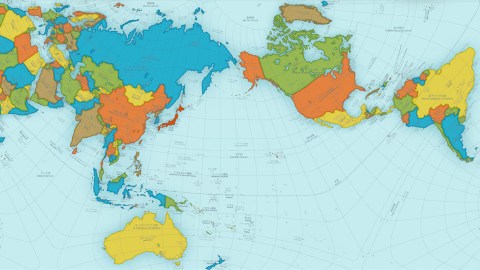
This year, the winner of the most prestigious design award in Japan – the Good Design Award – was the Tokyo based architect and artist Hajime Narakuwa, who has developed a new way to represent our spherical world on a rectangular surface by keeping faithfully the proportions of all oceans and continents – the AuthaGraph World Map.

AuthaGraph’s innovative mapping method (“by equally dividing a spherical surface into 96 triangles, transferring it to a tetrahedron while maintaining areas proportions and unfolding it to be a rectangle”) manages to improve on the other two popular ones – the Mercator projection, which creates distortions and the Dymaxion map, which corrects for the distortions but creates gaps.

A really cool “feature” of the AuthaGraph map is that it can be tiled without gaps while maintaining geographical relation between adjacent world maps.

From this map-tiling, new world maps can be formed with various regions at their center.

According to the makers, during the time the Mercator map was created and subsequently used throughout the centuries, our interest had been mainly on land. However, since the late 20th century “the resources and environment problems have spread our interests over the polar regions and oceans such as, (1) Sea ice around the North pole representing the global warming, (2) Territorial sea claims for marine resources, (3) An ozone hole above the South Pole, (4) Melting glaciers in Greenland, a cause that may submerge Tuvalu, (5) El Nino in the ocean, a cause of an unusual weather that eventually influence to the economy on land. The AuthaGraphic world map aims to provide a new view point to perceive the world by equally showing these interests spread over the globe.”
And how do 600 million year’s of continental drift look like on an AuthaGraph World Map?
Photos: AuthaGraph