The Refugee Map of Europe

Facts are like people. There are so many of them that you’ll always find a few to agree with you. Take Europe’s current refugee crisis: Rather than swaying hearts and minds, the emergency seems merely to have hardened and confirmed previous prejudices and opinions, of whichever stripe.
Reactions to the crisis range from the openly hostile to the warmly hospitable. Both extremes can be fed from the same set of facts. For instance, the current distribution of Syrian refugees.
Syria’s neighbours are bearing the brunt of the refugee crisis, and have done so for a lot longer than the current crisis. Turkey alone hosts around 2 million Syrians. That’s half of the total number of Syrians who fled their country; almost 1 in 10 of Syria’s pre-war population of 23 million; and more than any other country.
Lebanon is the temporary home of 1.2 million Syrian refugees, a remarkable feat considering its own citizenry numbers no more than 4.5 million. This means that Syrians now constitute almost a fifth of Lebanon’s population. The number of Syrians in Jordan, a country of 8 million, officially stands at 630,000, but in reality may be much higher. There are even a quarter of a million Syrian refugees in Iraq. How bad must things be before you tell your family: “Okay, enough with all the violence. Pack your bags; we’re moving to Baghdad.”?
Shouldn’t European countries, therefore, be more generous towards Syrians requesting asylum? A counterargument from the same dataset: What are other Arab countries doing for Syria? As confirmed by Amnesty International, the number of resettlement places offered to Syrian refugees by Saudi Arabia, the United Arab Emirates, Qatar and Bahrain is zero. How about they step up?
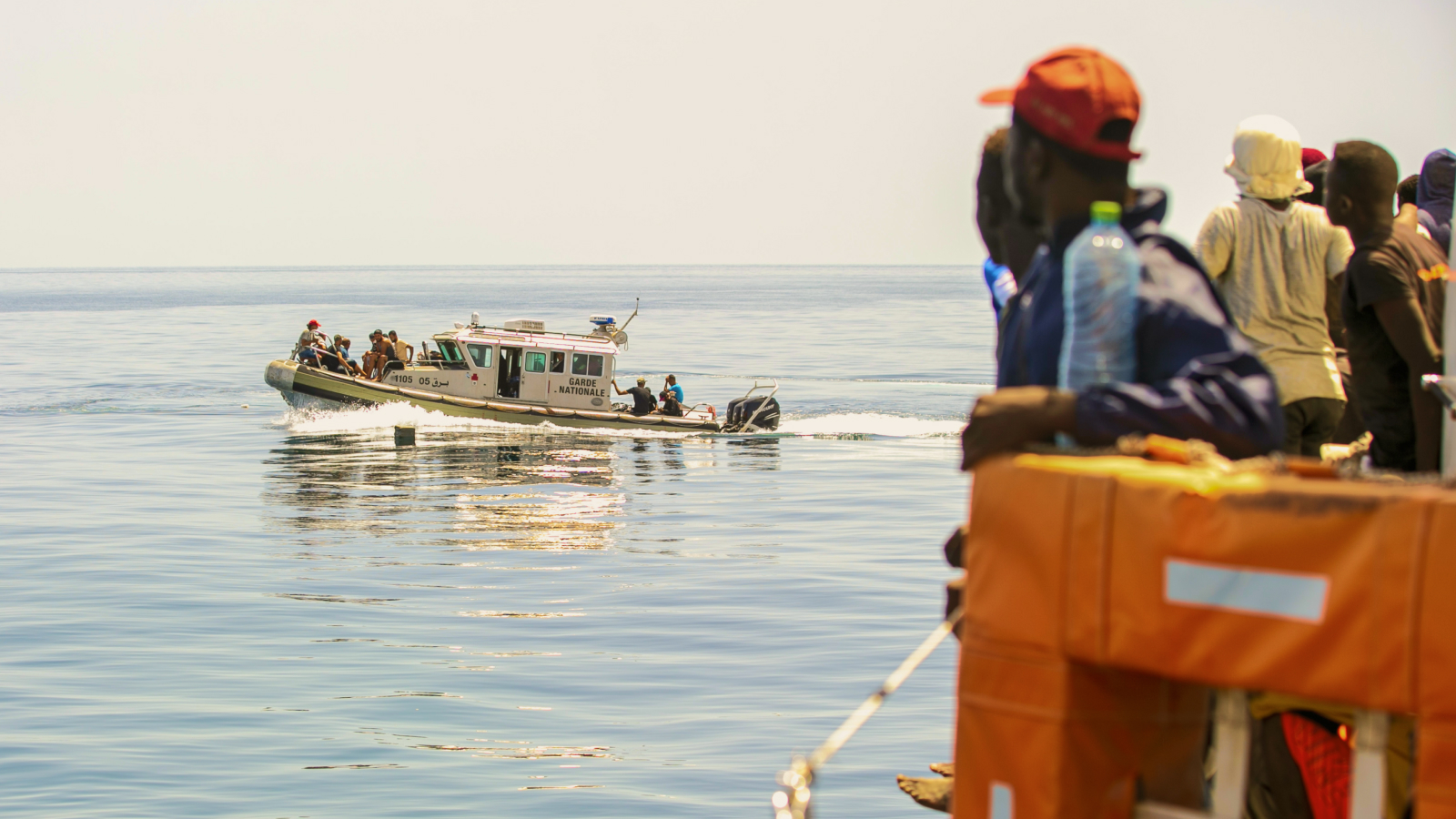
But the reality is that people are casting off their rickety boats in the direction of Europe, not Arabia. And not just to Europe in general, but to a few countries specifically.
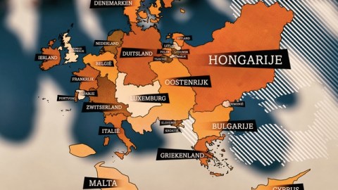
The situation at the moment is very fluid. Perhaps the best idea to get a clear picture of it is to take a step back. The maps below reflect the situation on the Old Continent in the first quarter of this year, i.e., before the present influx. Produced by Dutch public broadcaster NOS, they show where the 185,000 asylum requests were filed.
These maps are cartograms — ordinary maps distorted to reflect one statistical dataset, in this case: the number of refugees per million inhabitants. In other words, they reflect the relative impact of the refugee crisis on the countries of Europe.
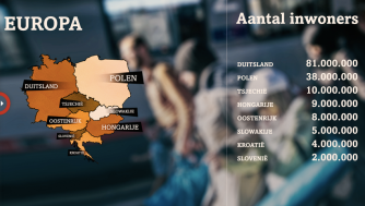
For the sake of calibration, first a normal map of Europe (to be precise: the western half of Europe), with the population sizes per country. Then, that same map reflecting the relative size of the refugee population. Germany keeps its size because it is the benchmark: It not only has the largest population (81 million), but also has the largest number of asylum requests per 1 million inhabitants (905). That works out to 73,305 asylum requests, or about 40 percent of the total quoted above.


Some other remarkably popular destinations — relative to the countries’ own population — are Malta (811 asylum requests per million inhabitants), Switzerland (507), and Luxemburg (482), all swelling up to several times their geographic size. Remarkably unpopular: Portugal (17) and Spain (44), which have become almost invisible on the second map.
A second set of maps shows Germany again, this time with countries in Eastern Europe, first with their actual geographies and absolute population figures, then proportioned for the number of asylum requests. With 3,322 requests per million inhabitants, Hungary, where many migrants enter the Schengen Area, is Europe’s asylum superpower. Austria is also very popular, with 1,141 requests per million inhabitants — in part because in Austria asylum requests are processed quickly, the NOS reports. The other countries on the map are almost squeezed off it: Slovakia (nine asylum requests per million inhabitants), Croatia (nine), but even Slovenia (22), the Czech Republic (34), and Poland (38) are all but invisible.


What do these maps tell us? That small frontline countries like Malta and Hungary are under incredible strain? That refugees generally prefer to not request asylum in the poorer countries of the E.U.? That all in all, the hospitality of the west is still dwarfed by that of Syria’s immediate neighbours? That the current crisis is not one of refugees, but of hospitality — or the lack thereof?
Whatever your opinions, you’re sure to find something here to support them.

An overview map of “refugee Europe.”
Many thanks to Erik Smit for sending in these maps, found here on the NOS website. Figures used as reported by Eurostat.
Strange Maps #737
Got a strange map? Send it to strangemaps@gmail.com.


