Carbon Copy Maps: Digging Coal, Digging Labour

Old news is an oxymoron. As its name indicates, the essence of journalism is the single-day attention span. Last week’s headlines? They’re already composting in the mainstream media’s backyard. Whatever manages to sprout from beneath that daily replenished dungheap must indeed be historical enough to warrant re-examination.
Fortunately, no such constraints apply to this blog; free to ruminate wherever, we can revisit the British election, even if now several weeks ago. And not because of some mulch-piercing historical insight, but rather for a more trivial delight of the cartographic kind.
The poll that returned David Cameron to 10 Downing Street and impressed the image of Maggie Simpson on the map of Great Britain for at least the duration of this Parliament (see #712), produced another example of the strangeness that electoral mappery is capable of.
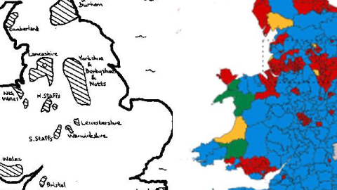
On the left: a map of Britain’s coalfields, the industrial exploitation of which reached its apex in the late 19th and early 20th centuries. The decline and death of coal mining in Britain was hastened in the 1980s under Prime Minister Margaret Thatcher. From a high of hundreds of coal mines in operation at the turn of the 20th century, only two deep mines remain: Kellingly Colliery in Yorkshire, and Thoresby Colliery in Nottinghamshire — with the latter slated for closure later this year.

However dead coal-mining might be as an industry, it has left a ghostly imprint on Britain’s political landscape. On the right: that Maggie Simpson map of this month’s election results (minus her yellow, spiky-haired Scottish head). Colours indicate which party won which particular constituency: blue for Conservative, red for Labour, orange for Liberal Democrat, green for the Welsh nationalists of Plaid Cymru.
The parallels are unmistakable. Even though there isn’t a perfect overlap, the hatched areas on the left correspond close enough with the red areas on the right. The conclusion: As Labour’s previous gains are rolled back and the party retreats back into its working-class heartlands, the common denominator between them becomes very clear — King Coal, even decades after his dethronement.
South Wales, once a large coal-mining area, still sends a lump of Labour MPs to Westminster from a contiguous zone practically overlapping the former mining area. The same goes for areas in North Wales and Lancashire (separate on the coal map, but linked on the votes map), in a zone covering Yorkshire, Derbyshire, and Nottinghamshire in the Midlands, and up in England’s far north in Cumberland on the west coast, and Northumberland and Durham on the east. There even seems to be a correspondence between smaller areas in both North and South Staffordshire, in Warwickshire and Leicestershire, and near Bristol.
Some glaring exceptions, though: no Labour MPs from the coalfields of Kent (were they perhaps never exploited?) And no coalfields for the host of Labour MPs elected in London (or did we stumble upon a forgotten chapter of the capital’s industrial past?) Its London MPs are Labour’s main ray of hope. They demonstrate that it’s a party rooted not only in the country’s industrial past, but also in its urban future. Of course, one could easily spin that story the other way. This Conservative commenter uses the map pair to argue that Labour’s failure to appeal beyond its traditional strongholds is an opportunity for the Tories to hit them where they live.
But most of all, the coal-to-votes maps reminded us of another map pair, which emerged after Barack Obama’s 2008 election victory. Focusing on Southern states, these two maps showed the overlap between counties that voted for Obama (in states that generally went for his opponent, the Republican John McCain) and areas where cotton was king, back in the 19th century and before.

So there seems to be a clear and lingering link between industrial areas, and their voting loyalty to left-of-centre politicians, even though the industries themselves (cotton and coal, respectively) have long since lost their industrial and social relevance.
Electoral maps — snapshots of particular moments in a nation’s present — have a way of revealing things about its deep past. Previously, this blog discussed the remarkable parallel between recent Polish elections and the imperial border that ran through its present territory a century ago (#348); and the cultural divide demonstrated by the political one in Ukraine’s presidential elections (#343). There must be others out there. Seen one? Send it in!
Many thanks to Kevin Jones for sharing the coal-to-votes maps, found on the website linked to above.
_________________
Strange Maps #714
Send your strange maps to strangemaps@gmail.com


