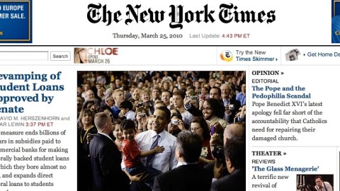
Design of the Times: Khoi Vinh and NYT.com

Why does the Web version of a newspaper look so different from the print version? It may sound like a simple-minded question, but the answer cuts to the heart of the difference between the print and the online experience. According to Khoi Vinh, design director of NYTimes.com, many people still consider print “canonical”: solid and tactile and official in a way that the Web is not. On the other hand, the Web allows for a dizzying variety of user behaviors—forcing Web designers to be nimble in predicting and reacting.
In his Big Think interview, Vinh describes one of the most successful features he’s introduced to the Times website, as well as a few features that were mysteriously and unexpectedly unpopular. He also expands on the subject of modern design more generally, describing it as a “conversation” between designer and user rather than a declarative statement which, once published, cannot be easily retracted.


