A Freakonomic Analysis
If you haven’t read the popular non-fiction book Freakonomics, I highly recommend it. Or, if it’s more your speed, you can visit the website associated with the book. The authors of the book, Steven D. Levitt and Stephen J. Dubner, even have their own blog!
Levitt and Dubner are running a series of articles in the New York Times Magazine that read much like the chapters in their book. The most recent article (free registration required, sorry) ran last week and sparked a number of thoughts about the issues around which this blog revolves. So, I thought I’d use this post to share those thoughts.
The article is about one doctor’s efforts to improve hand-hygiene compliance at Cedars-Sinai Medical Center. Dr. Leon Bender, the hospital’s Chief of Staff, along with other hospital staff, devised a number of incentive schemes to get doctors to be more diligent about washing their hands. They tried the usual campaign of memos, e-mails, etc. They formed a “Hand Hygiene Safety Posse” that walked around the wards handing out Starbucks gift cards to doctors caught in the act of washing their hands. These efforts increased compliance to about 80%, but they needed 90% compliance to satisfy their accrediting agency (really? only 90% compliance is sufficient?).
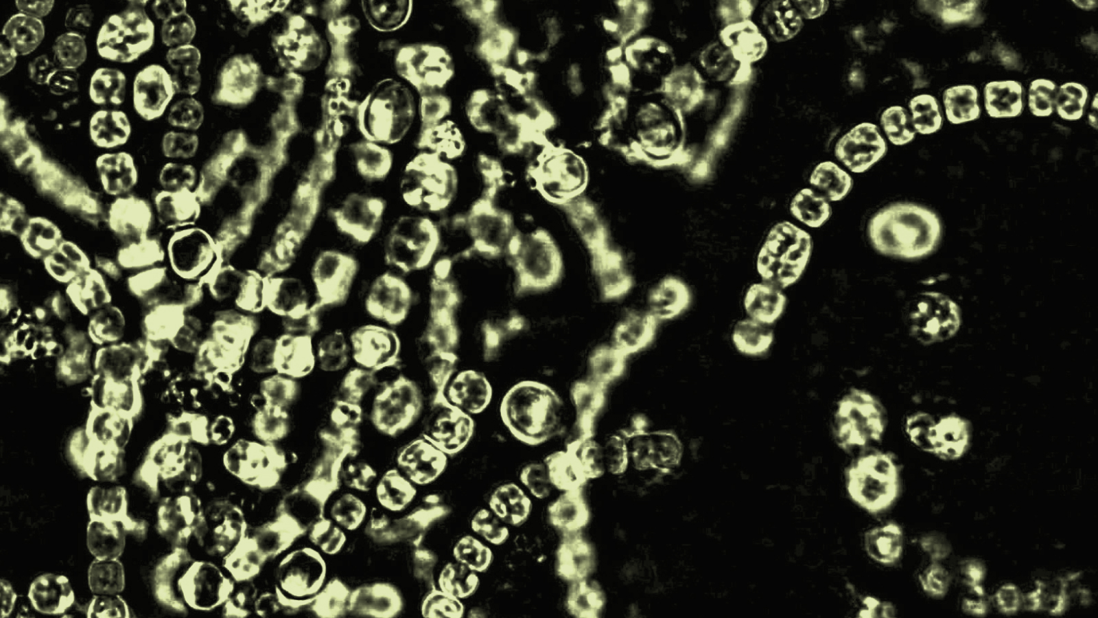
So, one day, during a meeting of Dr. Bender’s Chief of Staff Advisory Committee, the hospital’s epidemiologist took a culture of the hands of the committee members. The members pressed their palms into agar plates, and the plates were cultured and photographed. When the results came back, the images were apparently “…disgusting and striking, with gobs of colonies of bacteria.” The hospital administration decided to use the power of those images by making one particularly disgusting image the screen saver on all hospital computers. Suddenly, hand-hygiene compliance shot up to nearly 100%.
Dr. Bender’s explanation is what struck me the most. He said, “With people who have been in practice 25 or 30 or 40 years, it’s hard to change their behavior. But when you present them with good data, they change their behavior very rapidly.”
There are obvious implications of that quote for DDDM, but I’ll pass on that discussion until Thursday’s post. For today, I’m more interested in the implications for school leaders trying to facilitate technology integration (a term of art, BTW, that will be the subject of tomorrow’s post). One of the greatest challenges facing technologically-inclined school leaders is getting veteran teachers (even those who’ve been teaching the same way for 10 or so years) to change their behaviors. After Dr. Bender’s explanation, the NYT article goes on to say that “some forms of data, of course, are more compelling than others, and in this case an image was worth 1,000 statistical tables.”
So, the question for me is, “what kinds of ‘data’ (broadly conceived) can we present to teachers that would compel them to change their behaviors and to integrate technology more into the teaching and learning process?” I like to show my students a PowerPoint slide that contains two photos side-by-side. One image is of a classroom from the 1880’s; the other is of a classroom from the 1980’s.


(photos from Raymond Bial’s One Room School and PBS’s evolving classroom series)
Not surprisingly, the classrooms look nearly identical. That photographic juxtaposition is usually pretty compelling. I also think David Warlick’s letter from principals is a compelling artifact.
What other data can you think of? Are there other “frightening” images or artifacts we can use to “scare” teachers (and administrators, for that matter) into changing their behaviors?