Does Islam Prevent AIDS?

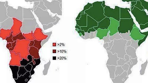
Maps have many fathers. One of them is the genie of omission. So beware of the map that is too straightforward and simple. It may very well be obscuring something. For also in cartography, this general rule applies: If it looks too good to be true, it probably is. An interesting point in case are the twin maps of Africa shown below, one of the spread of Islam, the other the spread of AIDS. The contrast is striking: where one occurs, the other is absent. Is this proof of Islam’s salutary effects? Or do the maps merely demonstrate the power of map-based propaganda?
The message implied by the juxtaposition of these two maps is clear and simple: Islam is the best form of AIDS prevention. These maps first popped up on Pass the Knowledge [1], the blog of Dr. Bilal Philips. A Jamaican native, Dr. Philips grew up in Canada, where he converted to Islam. He studied in Saudi Arabia and the UK, and currently resides in Qatar. Dr. Philips’ supposedly extremist views have gotten him expelled or barred from half a dozen countries. As recently as January 28, his blog re-posted a speech by Anwar al-Awlaki, the Yemeni-American propagandist of jihad who was killed by a US drone strike in 2011.
These maps, posted mid-October last year [2], are a lot less inflammatory. For cartography doesn’t pontificate with the partisan rhetoric of religious conviction; it merely demonstrates, by the disinterested logic of facts and stats. It makes the message of these maps all the more immediate, irrefutable and convincing. For this purports to be objective proof that Islam and AIDS occupy opposite ends of the moral spectrum.

Where the purity of the one true religion prevails, AIDS has no chance. And where AIDS is rampant, Islam is virtually absent. The traffic-light symbolism underscores that binarity: Red, the color of blood, danger, death (and, in this case, AIDS), is bad; green, a soothing, peaceful, Islamic color, is good. All of which explains why these maps have been so eagerly passed around on Facebook, Twitter, and other social media over the past few months — a mention of the map on Dr. Philips’s own Facebook page [3] was shared over 12,000 times.
Indeed, advocates of Islam could see these maps as cartographic proof of the blessedness of their chosen path — as demonstrated by some of the commenters on Facebook. “Islam makes everything easy for us. ALLAH-HU-AKBAR,” one commenter writes. “It’s very clear that NIKKAH [Islamic marriage] is the solution of today’s world deadliest disease,” says another. “If we follow the guidance of the Holy Quran and the Prophet (SWA) then we shall never be attacked by such deadly diseases,” concluded yet another. But one commenter complains: “I love Allah but these statistics are incomplete! Please provide accurate information.”
It’s unclear where Dr. Philips found these maps. There is no earlier trace of them online. The information used to compile them seems in line with freely available data on both the prevalence of AIDS and the spread of Islam in Africa, from the World Health Organization [4] and the Pew Research Center [5] respectively — notwithstanding a few important discrepancies. But the main question raised by these two maps is: Do they represent causation (A, therefore B) or mere correlation (A, and also B)?
The answer, it turns out, will please both sides of the debate, or (more likely), neither: It’s a little from column A, a little from column B. As with any map crafted to make a point, what we don’t see in these two is at least as interesting as what we do see. But the maps do reflect two incontrovertible facts. First: No region on Earth is as racked by HIV/AIDS as Sub-Saharan Africa: 70 percent of the 35 million people currently living with the disease reside in this part of the world. And second, Africa’s northern third is overwhelmingly Islamic. Less than 1 percent of those living in Morocco, Tunisia, and Mauritania are non-Muslim. Fewer than 5 percent of people in Somalia, Niger, Algeria, Djibouti, Sudan, Libya, Senegal, and Gambia follow a faith other than Islam. And at least 84 percent of those in Egypt, Mali, and Guinea, are Muslim.
In most countries south of Africa’s Islamic North, Christianity is the majority or co-dominant religion. While the incidence of HIV/AIDS is close to a quarter of the adult population in some of the worst-affected countries there, the reported infection rate is as low as 0.1 percent in Egypt, and well below 1 percent in most of the dark green countries on the second map. So the map seems to reflect a socio-cultural truth: In Africa, HIV/AIDS strikes least where Islam dominates, while the disease rages most in countries where there are fewer Muslims. Figures for both variables tend to wobble according to different sources, because hard data is scarce, and/or it is politically expedient for a particular country to have more or less believers in this or sufferers of that. The figures quoted here, from the Pew Research Center and the CIA World Factbook, are as accurate as one is likely to get, yet will seem too high or too low to some observers.
Those figures are also at variance with the picture presented by these two maps. Granted, the AIDS emergency in Southern Africa is very serious. But the oversimplification presented here seems to serve no purpose other than to underline the basic dichotomy between AIDS and Islam. On the AIDS map, eight countries appear in the darkest red, which indicates that their HIV/AIDS penetration rates are over 20 percent. In fact, while the disease is prevalent in all eight, only Swaziland, Botswana, and Lesotho are in this category — only they should be marked dark red: the map does not adhere to its own legend. And this obscures another relevant fact: South Africa has a much higher number of HIV/AIDS patients than those three much smaller countries put together — 6.3 million vs. less than 1 million, combined — but its overall infection rate is “only” 19.1 percent. Similarly, Zimbabwe, Namibia, Zambia, and Mozambique, are doing better than the depressingly dark crimson on the map would indicate.
The Islam map works with a different set of percentages than the AIDS map, perhaps to produce the cleanest border possible between the Muslim-majority and AIDS-infested parts of Africa. But by discounting all countries with fewer than 30 percent Muslims, the Islam map severely misrepresents the religion’s true distribution across Africa. Cameroon is 24 percent Muslim (representing over 5 million people) — far more than the roughly 2 million Muslims in Eritrea (or 36 percent, according to Pew, and thus should be light green rather than dark green, as indicated on the map). In countries with infection rates high enough to be marked dark red, like Kenya and Uganda, there are also significant Muslim minorities (11 percent or well over 4 million in Kenya, 12 percent or 4.5 million in Uganda). And Ivory Coast — with an infection rate of 3 percent and a 36.9 percent Muslim population — should be light red (instead of dark red) on the left map, and light green on the right (rather than being unmarked).
Despite this attempt to keep the border between both as “clean” as possible, Islam and AIDS overlap in three countries. Nigeria, Chad, and Ethiopia are all painted in the lightest shade of red on the AIDS map, and the lightest hue of green on the Islam map. But of course one might conclude: These countries are all about half Islamic. It makes sense that their other halves are touched by AIDS, but tempered to a lighter red by these countries’ “greener” half. The overlap thus weirdly reinforces the idea of a strict Islam/AIDS boundary running through Africa, by suggesting that it runs clean through each of those three countries too.
But that idea doesn’t quite stand up to scrutiny. It is Ethiopia, the least Islamic country of the three, that has the lowest HIV/AIDS infection rate (at 1.4 percent). Both Nigeria and Chad are just above 3 percent. Widening the scope beyond Africa further diminishes the reverse-causal link between Islam and AIDS implied by these maps. And while it’s true that North African countries have extremely low HIV/AIDS infection rates, so do countries outside of Africa. Many of these, like Saudi Arabia, Turkey, or the Maldives, are also Muslim. But many with equally small AIDS “scores” are not, including the majority-Buddhist Sri Lanka, largely non-religious Japan, and majority-Christian Hungary.
If equally low infection rates can be achieved in countries not dominated by Islam, then perhaps these maps are confusing correlation with causality. That would undermine Islam’s unique selling point as presented by these maps: that the religion’s strong injunction against sins (and HIV/AIDS risk behaviors) such as homosexual and extramarital intercourse and (intravenous) drug use are responsible for the much lower rate of infection in Muslim countries. Yet that indeed seems Dr. Philips’ point in showing the maps, for he sees AIDS as the just desserts for sinful, un-Islamic behavior: “The punishment of God may come in a variety of different ways. Perhaps the most obvious punishment afflicting humankind in all countries today is the disease of AIDS.” [6] That argument is not limited to Islam, of course. Many will be familiar with similar sermons from the fire and brimstone end of the Christian spectrum.
But assertions that moral purity is the one and only bulwark against AIDS should not be taken at face value. Taboos on gay sex, extramarital affairs, and intravenous drug use, all particularly strong in the Muslim world, may push those behaviours to the margins, but don’t make them disappear. Up to a third of young men in the Arab world have pre-marital sex, as do nearly one in five young women [7] — a fact so counter to prevailing morals that operations repairing hymens (and thus “restoring virginity”) are common in the Middle East.
In addition, [the Middle East and North Africa (MENA) are increasingly becoming a “region of concern” for HIV/AIDS: The number of people living with HIV in the MENA region increased by 73 percent between 2001 and 2012, and new infections went up 52 percent. AIDS-related deaths — 17,000 in 2012 — more than doubled in that interval, even while they dropped 16 percent in the rest of the world. [8] Although HIV/AIDS may still not be curable, it is treatable. But getting proper antiretroviral treatments to those who require it can only happen if both patients and their families, as well as medical staff, are willing to acknowledge the true nature of the disease. And its causes: The main routes of transmission include sharing of needles by drug users, unprotected sex with prostitutes, or men having sex with other men.
Because of strong local taboos on those “sins,” the MENA region has the lowest antiretroviral treatment coverage in the world; only 8 percent of infected pregnant women, for example, receive such treatment. With an HIV prevalence of 0.1 percent in 15-to-49-year-olds, MENA may have the lowest infection rate of any region in the world, but it is also one of only two regions where AIDS-related deaths are still on the rise. “These countries cannot count solely on their cultural and religious values to safeguard their populations against the HIV infection,” warns the Population Reference Bureau in a recent report [9] on HIV/AIDS in the region.
At least the region’s governments have taken note of that message. Most have moved beyond the blunt denial that HIV/AIDS even existed within their borders. Many governments in MENA now actively engage in public health programs to prevent and treat the disease. In Morocco, for instance, the integration of HIV into public health services expanded the number of people receiving HIV counselling and testing from 46,000 in 2010 to 222,620 in 2012, while coverage of services for HIV-positive pregnant women to prevent mother-to-child HIV transmission rose from 29 percent in 2010 to 48 percent in 2012 [10].
As it turns out, these maps do demonstrate a great truth about AIDS and Islam. But it is not the triumphalist message that Islam alone is an effective shield against HIV/AIDS. Rather, it is the more complex warning that while strong morals may have kept the HIV/AIDS toll in Islamic Africa low until now, the correspondingly strong taboos could keep the disease invisible and its numbers rising, against the global trend.
_________________
Strange Maps #725
Seen a strange map? Let me know at strangemaps@gmail.com.
[1] https://passtheknowledge.wordpress.com/
2] https://passtheknowledge.wordpress.com/2014/10/14/interesting-statistics-of-muslim-population-and-prevalance-of-AIDS-in-africa/
[3]
[4] http://apps.who.int/gho/data/node.main.621?lang=en
[5] http://www.pewforum.org/2011/01/27/table-muslim-population-by-country/
[6]
[7] http://www.ft.com/intl/cms/s/2/8a68b5aa-8bf6-11e2-b001-00144feabdc0.html#axzz3PZs6yN3c
[8] http://www.avert.org/hiv-AIDS-middle-east-north-africa-mena.htm
[9] http://www.prb.org/Publications/Reports/2014/middle-east-hiv-AIDS.aspx
[10] UN AIDS 2013 Global Report


