25-26° N: the world’s most perilously populated parallel
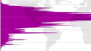
- As this population density map shows, people would rather live where it’s too hot than too cold.
- More than 1 in 30 humans live in a thin band bordered by the 25th and 26th parallel north.
- But for how long? Population growth and climate change may disproportionately affect this strip of Earth.
Red and blue are a highly evocative color pairing. Put them together, and you can’t help but think hot or cold. Or left and right.
A map of red and blue, but not politics
Ironically, their political symbolism is reversed on either side of the Atlantic. In the U.S., red states are to the right (figuratively, of course) of blue ones. In Europe and other parts of the world, red is the color of the revolutionary left, blue of the conservative right.
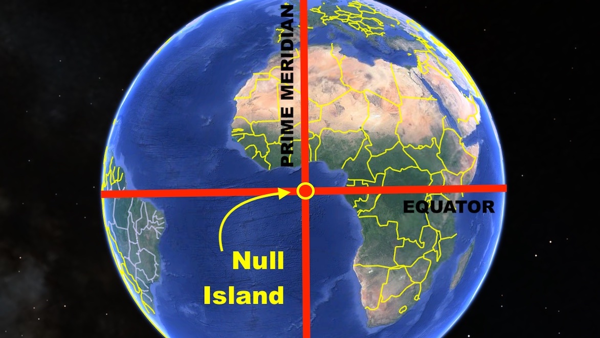
So, which is it in this Strange Map? The various shades of blue and red are distributed latitudinally, in bands parallel to the equator. In other words: across national borders. Ignoring the most primal of human-made obstacles means it’s unlikely that they denote a political divide.
Hot and cold, then? Not a bad guess: red congregates around the equator, blue is exiled near the top and bottom of the map — almost invisible in the south, where it occupies a tenuous toehold on the narrowest sliver of Patagonia, in the very south of South America.
But no. No political zones, no bands of average temperature. Red means high population density, the redder the denser. Blue is for low population density, emptier as the hue of blue darkens.
However, that distribution does seem to suggest a connection to the alternate hot/cold symbolism of the color pair: humanity thrives in warmer climes and doesn’t really care for the planet’s coldest extremities. It figures. I would rather it be too hot than too cold.
Let’s have a closer look at the map.
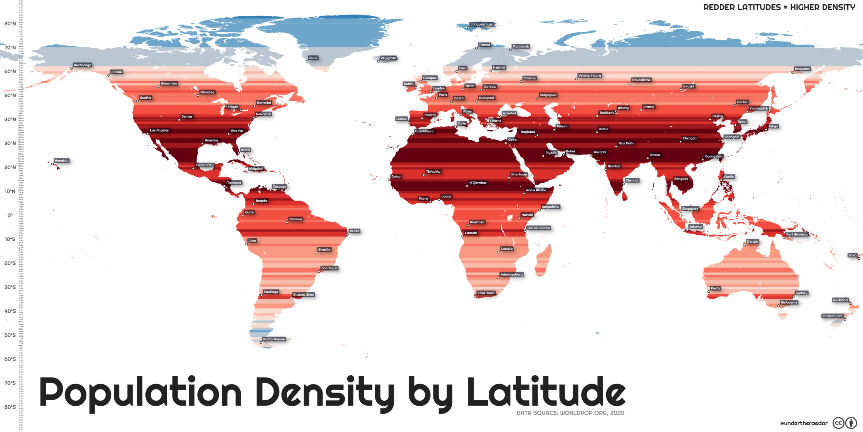
Most of Europe and the top half of North America are colored in lighter shades of red. The darkest, most populated zones are a bit further south. Quite a few of the dark red bands run through the Sahara. No, you didn’t Rip-van-Winkle through the greening of the desert. The Sahara is still sandy and empty.
Megacities of Asia
So, why are these latitudes marked dark red? The results are skewed by the megacities of Asia, which occupy these same latitudes. These include Tokyo (Japan), Shanghai (China), Bangkok (Thailand), Dhaka (Bangladesh), Chennai (India), Karachi (Pakistan), and Tehran (Iran). The population of those seven cities alone adds up to 137 million, which is more than Mexico, the 10th most populous nation on Earth.
This map was produced by Alasdair Rae and first published by Visual Capitalist. The original article mentions that “the 25th and the 26th parallel north [are] the most densely populated latitude circles,” with “[a]round 279 million people liv[ing] in these latitude lines, which run through large countries like India, Pakistan, Bangladesh, China, the United States, and Mexico.” That is a bit confusing, because the lines themselves have no area, hence no population. Perhaps we may assume that they meant the area in between the 25th and the 26th parallel north.
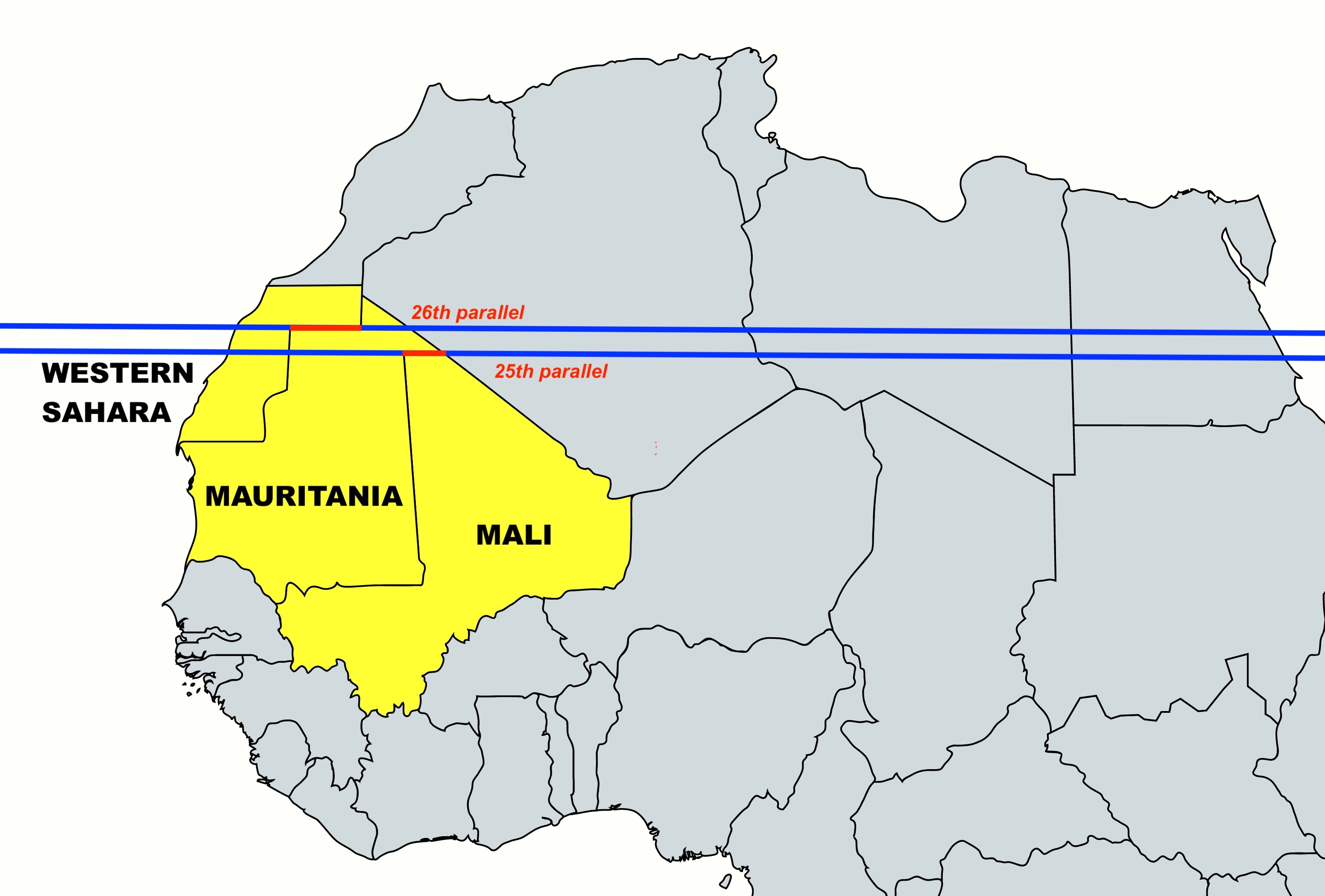
Here’s a quick and easy way to find this strip of land on a world map. Turn your attention to North Africa, particularly to the northern tip of Mali. Its 108-mile (175-km) straight-line northern border with Mauritania is the only bit of the 25th parallel that doubles as an international border.
Now cast your eyes slightly northwest, to the 207-mile (333-km) straight-line border between Mauritania and Western Sahara. This is the only part of the 26th parallel that also is an international border.
A narrow band of humanity
Project that narrow band across Earth, and even though it crosses vast deserts and oceans, it contains more than one thirtieth of humanity (3.6%, to be exact, so closer to 1/28th). Given that Earth’s population is about 7.75 billion, this represents roughly 280 million people.
So far, so statistically trivial. However, two trends conspire to turn this map into a predictor of major problems to come. Those are: population growth and climate change. This map does a better job than most in pointing out that most people live in latitudes where the climate is already quite hot.
And many of these areas will see massive population growth this century. According the the United Nations, global population will continue to rise, from about 7.8 billion today to almost 11 billion by 2100. (This, however, is not accepted by everyone. Some demographers predict underpopulation will become a major problem in the future.) If the UN projection is correct, global population density will increase from 153.1 people per square mile (59.11/km2) to 209.3 people per square mile (80.82/km2).
As climate continues to change, it is the most densely populated latitudes that may become unbearably hot, for increasingly longer parts of the year. One solution could be, as discussed in Strange Maps #842, massive migrations, moving people from the newly-uninhabitable parts of the world to the newly-habitable ones. In other words, a version of this map in the year 2100 could be the inverse of this one: redder toward the poles, bluer near the equator.
Strange Maps #1149
For two slightly similar exercises, check out Strange Maps #563, exploring the world’s population, divided by latitude and longitude.
Got a strange map? Let me know at strangemaps@gmail.com.
Follow Strange Maps on Twitter and Facebook.