How Polluted Is Your Neighborhood? A New Map Has Answers.

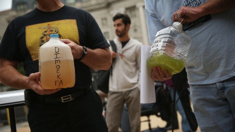
The Environmental Protection Agency (EPA) recently announced the release of its Environmental Justice (EJScreen) mapping tool. It combines numerical indexes from various regions and allows users to compare their area’s air quality and other environmental conditions to the nation’s. The tool is meant to inform and educate the public with demographic and environmental overlays on an interactive, easy-to-read map. The program allows users to search for their address and get a breakdown of how healthy the air is or whether you live near a toxic dump site. Stuff people usually like to know about.
EPA Administrator Gina McCarthy said in a statement:
“EJScreen provides essential information to anyone seeking greater visibility and awareness about the impacts of pollution in American communities. EJScreen has been a valuable resource for EPA to advance our commitment to protect Americans most vulnerable to pollution. I’m excited to share this tool with the public to broaden its impact, build transparency, and foster collaboration with partners working to achieve environmental justice.”
McCarthy has said before how, when it comes to environmental issues, government agencies like the EPA are charged with setting a stage for solutions rather than taking action themselves. “The market delivers the solution,” she explains. The EPA therefore focuses its attention on massaging the market with standards and sanctions that are informed by science in order to promote better, more verdant business practices on a long-term scale.


