That chilling coronavirus video graph? It only tells half the story.

Image: Abacaba
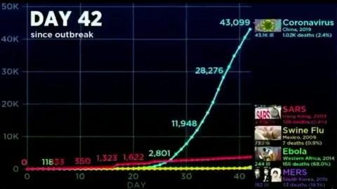
- A terrifying graph shows how the spread of coronavirus overtakes previous epidemics like Ebola, SARS and MERS.
- However, the clip is only part of a longer video – and conveniently cuts off before swine flu surpasses COVID-19.
- The wider context: the coronavirus outbreak remains relatively small and is comparatively non-lethal.
How is the #coronavirus compare to #H1N1, #MERS, #Ebola and #SARS ? #COVID19
WATCH THIS VIDEO GRAPH:
— COVID19 (@COVID_19_News) February 21, 2020
How to lie with statistics
This video, posted on Twitter on 22 February, shows how the coronavirus (COVID-19) epidemic compares to that of other recent outbreaks. Terrifyingly, the line for the coronavirus skyrockets, leaving those for SARS, MERS, ebola and swine flu far behind.
Alarming? Yes. But not the whole story. As Mark Twain once said: There are three kinds of untruths: “Lies, damned lies and statistics.” If he were around today, he might add a fourth: video edits. The 30-second clip is part of a 10-minute video with exactly the opposite message: Do not panic!
When the video was posted, the coronavirus was less than two months old, and had already travelled from its ground zero—a so-called ‘wet market’ in the Chinese city of Wuhan—across several continents, infecting more than 40,000 people. It had just killed its 1,000th victim.
The no-panicking message still holds, even half a month and more than double the number of cases later. As of 1 March, we’ve passed 86,900 people infected, with just under 3,000 deaths reported. Why? Because context is everything.

Mexican police officer wearing a face mask during the swine flu outbreak of 2009.
Image: Eneas De Troya, CC BY 2.0
Virus speed comparison
First, the standalone clip, which has been seen more than two million times. It compares the speed of the coronavirus outbreak to that of a few other recent ones:
- SARS (started in Hong Kong in March 2003),
- swine flu (started in Mexico in March 2009),
- ebola (started in Western Africa in March 2014), and
- MERS (started in South Korea in May 2015).
For the sake of comparison, the graphs for each epidemic are aligned so they all start together on Day One of each outbreak.
- At first, Ebola is the scary one. Not only had it infected the most people after just one day, it had killed two thirds of those.
- By comparison, SARS killed its first victim only after three days (out of 38 people infected).
- By Day 10, SARS had overtaken Ebola as the most infectious of the outbreaks (264 vs. 145 patients), but the latter was ten times more lethal (91 dead from Ebola vs. 9 from SARS). At this time, the coronavirus had infected 39 people, killed none, and was still playing in the same minor league as the swine flu and MERS.
Exponential rise
- Day 20, and SARS cases are skyrocketing: 1,550 people are ill, 55 have died. That’s a death rate of 3.5%. Ebola has affected only 203 people by now, but killed 61.6% of them, a total of 125. Meanwhile, the coronavirus has taken Ebola’s second place, but is still far behind SARS (284 infected). At this time, the coronavirus has claimed the lives of just five people.
- But now the coronavirus cases are exploding; by Day 30, the new virus has infected 7,816 people, killing 204. That’s far more infected than any other virus (SARS comes a distant second with 2,710 patients), and significantly more killed (Ebola, though still just 242 people ill, has killed 147, due to its high fatality rate). Meanwhile, MERS is stuck in triple digits, and the swine flu in double digits.
- Day 40: coronavirus cases (40,553) dwarf those of SARS (3,550). The swine flu (369) has overtaken ebola (243), at about the same level as MERS. Also in terms of fatalities, coronavirus now far supersedes SARS (182), ebola (164) and the swine flu (5).
About here, the clip cuts out. The editing aims to focus the attention on the exponential rise in coronavirus cases. But as the longer version goes on, the story changes.
The FULL video of that viral Twitter snippet
- By Day 60, it’s the swine flu cases that have exploded, to more than 60,000 people ill and 296 people killed—surpassing Ebola (183), if not SARS (513).
- The swine flu numbers keep growing exponentially: by Day 80, they’ve passed 362,000 cases (and 1,770 deaths), far surpassing any of the other diseases.
- Day 100: swine flu cases are approaching 1 million, deaths have surpassed 5,000. That’s far more than all the other diseases combined—they have merged into a single line at the bottom of the graph.
- By Day 150, swine flu hit 5.2 million patients, with 25,400 people killed. By the time it was declared over, a year later, the outbreak would eventually have infected more than 60 million people and claimed the lives of almost 300,000.
Swine flu was caused by the H1N1 virus, which also caused the Spanish flu. That outbreak, in 1918/19, infected about 500 million people, or 1 in 3 people alive at that time. It killed at least 50 million people. It was the combination of extreme infectiousness and high fatality that made the Spanish flu such a global, lethal pandemic.
None of the other infectious diseases comes close to that combination. The swine flu, although more infectious than other diseases, was less infectious than the Spanish flu, and also less deadly (0.5%). Unlike COVID-19 or its fellow coronaviruses SARS and MERS, Ebola is not spread via airborne particles, but via contact with infected blood. That makes it hard to spread. Ironically, it may also be too lethal (39.6%) to spread very far. And COVID-19 itself, while relatively lethal (2.4%), is well below the deadliness of the Spanish flu, and does not seem to spread with the same ease.
Best strategy
Providing further context to the relatively small danger that the coronavirus poses to your personal health, the video ends by comparing the virus’s most deadly day so far (108 people killed on 10 February) to the average causes of death worldwide for that day.
On average 151,600 people die every day. On 10 February, the coronavirus killed a lot less than people were killed by
- Influenza (650, in the US alone)
- Drowning (877),
- Homicide (1,095),
- Suicide (app. 3,000)
- Car crashes (3,287)
- Stroke (13,689)
- Heart disease (24,641)
- Cancer (26,283).
In short: yes, the coronavirus is spreading faster than other epidemics did in their first two months, but it does not seem to be spreading with the speed of the swine flu, let alone the Spanish flu; and it is much less lethal than the latter (if more so than the former). The video concludes that the best strategy for your health is to:
- focus your attention on beating more likely causes of death by eating well, exercising enough and driving safely.
- beat the coronavirus by staying informed and cautious rather than obsessed and panicked.
Video produced by Abacaba and foundhereon YouTube. See also Snopes.com for more on the veracity of the shorter clip.
Strange Maps #1013
Got a strange map? Let me know at strangemaps@gmail.com.


