Can a Classic Museum Really Be Made Modern?

Every new cultural institution hopes for “The Bilbao Effect”—the economic boom the faltering, former industrial city of Bilbao, Spain, enjoyed after the 1997 rise of architect Frank Gehry’s game-changing design for the Guggenheim Bilbao Museum. But even old cultural institutions want some of that same magic. So, when Gehry came to see Barnett Newman’s The Stations of the Cross with artist friend Ellsworth Kelly at the Philadelphia Museum of Art back in 2006, the museum’s then director and CEO, Anne d’Harnoncourt, approached Gehry about “doing something special” there, too. However, instead of a new signature “Gehry” look, d’Harnoncourt requested “a quiet intervention”—an underground “Philadelphia Effect.” In Making a Classic Modern: Frank Gehry’s Master Plan for the Philadelphia Museum of Art, the PMA finally unveils their “master plan” for revitalizing their classic main building first opened in 1928 for the 21st century. The big question hanging over this whole decade-long, estimated half billion dollar project remains: can a classic museum really be made modern?
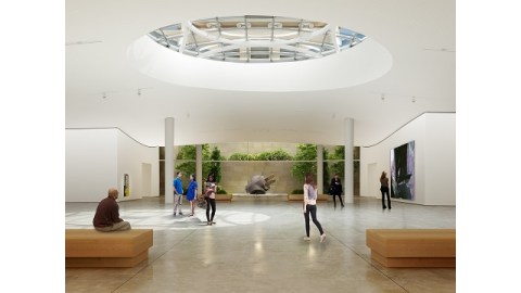
The irony of bringing to light this “master plan” 8 years in the making is that almost all the changes will take place underground, specifically excavations beneath the iconic “Rocky Steps” that will add more than 169,000 square feet of exhibition space to allow the PMA to double the room for their Asian and American collections and nearly triple their modern and contemporary art space. (A rendering of what those new galleries would look like appears above.) Whereas most old museums undergo a facelift when making structural changes, the better medical metaphor for Gehry’s plan is bypass surgery. Those who know the PMA’s layout know full well the sometimes circuitous routes one had to take around the museum. When finished, Gehry’s bypass surgery will free up circulation throughout the museum, creating a more inviting, user-friendly experience.
The key blockage Gehry had to contend with was the already existing auditorium situated in the center of the building. Faced with the museum’s period rooms, Indian temple, and other immovable “sacred cows,” Gehry convinced the museum that once he could “pull the cork out” and move that auditorium, the rest of the plan would fall into place. Gehry characterizes his design as a “collaboration” with the building’s original architects, Horace Trumbauer and Julian Abele. Thanks to the “DNA” of their original design, Gehry could work his underground magic. “I’m willing to put this building up against the Met [in New York City] anytime,” Gehry bragged at the press preview. “The Met doesn’t have DNA to do something like this.” “It’s rare to have the bones of the existing building show you the way to expand it,” Gehry said elsewhere. “All you had to do was follow the yellow brick road.” A 600-foot stone corridor running the length of the museum but closed to the public for half a century, elevator shafts never completed with actual elevators, tall windows shuttered for decades—all this genetic material of the original building finds new life in Gehry’s designs.
This isn’t the first time Gehry’s worked his wonderful wizardry on an existing museum. Both the Norton Simon Museum (in 1999) and the Art Gallery of Ontario (in 2005) underwent sensitive restorations by Gehry in hopes of modernization without losing their established identities. “Rather than a tumultuous creation, [the Art Gallery of Ontario] may be one of Mr. Gehry’s most gentle and self-possessed designs,” Nicolai Ouroussoff wrote at the time, marveling how “its interiors underscore one of the most underrated dimensions of Mr. Gehry’s immense talent: a supple feel for context and an ability to balance exuberance with delicious moments of restraint. Instead of tearing apart the old museum, Mr. Gehry carefully threaded new ramps, walkways and stairs through the original.” Philadelphia may be hoping for “The Bilbao Effect,” but they want it done “The Ontario Way.” Similarly, current PMA Director and CEO Timothy Rub (who succeeded d’Harnoncourt after her sudden death in 2008) oversaw a $350 million dollar renovation during his time at The Cleveland Museum of Art, so neither is a newcomer to large-scale changes to old museums. The PMA, one of the finest art museums in America, represents a challenge bigger than ever before for both men.
Unfortunately, the Gehry name continues to be one of the most polarizing in modern architecture. It seems that most people either love or hate The Guggenheim Bilbao and other signature Gehry works. The pejorative title of “starchitect” was practically invented in response to Gehry and his Bilbao project. Even The Simpsons spoofed Gehry’s style in an episode in 2005 when the animated architect came to Springfield to build their new concert hall on a design inspired by Marge’s (initially rejected and then crumpled) letter to Gehry. The one aspect of Gehry’s PMA plans that’s attracted the most attention has been the proposed “City Window” to be cut from the “Rocky Steps” to allow passersby to look in as well as for patrons inside to look out at the Philadelphia skyline. Aside from two new, exterior stair towers required by building codes, the “City Window” would be the most visible change to the existing building. Many critics have centered their rejection of the plan on this “City Window”( including Kriston Capps, who first criticizes Gehry for not making the PMA “Gehry” enough and then criticizes Gehry for this one high-visibility, “Gehry” touch). Gail Harrity, the PMA’s President and Chief Operating Officer, stressed to the press that the “City Window” had not yet been approved by the board, so any changes to the sacred “Rocky Steps” are not yet a done deal. Someone should figure out the inverse mathematical relationship between one’s distance from Philadelphia and one’s understanding of the city beyond the Rocky films, because locals who enjoy the PMA would gladly sacrifice some stair space for what could literally be a whole new window on the region’s central cultural gem.
The exhibition Making a Classic Modern: Frank Gehry’s Master Plan for the Philadelphia Museum of Art, which runs through September 1, 2014, makes Gehry’s vision plain for all to see with renderings of what the final product will look like as well as scale models that figuratively “crack open” the old building to show how the architect freed all those hardening arteries. At the end of the exhibition space, the PMA added a helpful reminder of what this “master plan” is all about—showing great art, and more of it. Selections from the Asian, American, and modern and contemporary collections—some recent acquisitions, some rarely placed on view due to current space restrictions—remind us that art unseen is art unknown. Standing in front of a portrait of performance art pioneer Joseph Beuys done by Andy Warhol, who sprinkled diamond dust into the paint, I wondered at the magical effect of the precious gem and silently hoped that Gehry’s plans eventually prove to be the magic dust necessary to transform the PMA for the 21st century.
At the press preview, Gehry joked that Bilbao named a bridge after him for the benefits his museum design brought them, so what would Philadelphia do someday? Making a Classic Modern: Frank Gehry’s Master Plan for the Philadelphia Museum of Art shows how the PMA looks to Gehry as a bridge from the 20th to the 21st century—a new age when cultural institutions can’t passively expect audiences to enter but in which they must create inviting spaces tailored to visitors’ wants and needs. “Look inside,” Timothy Rub offered as a mantra for the new design, a call to future visitors to see what’s new while still appreciating what’s old—the classical humanist faith in art itself to elevate, entertain, and enlighten. More than a few critics will be watching closely and secretly hoping for Gehry and the PMA to fail. But even more will be looking at this grand master plan as a template for the future of museums as they compete for an audience in an increasingly multimedia world. What will be the final answer? Only time will tell.
[Image: The new underground galleries will be lit in part by a skylight in the East Terrace, Rendering © Gehry Partners, LLP.]
[Many thanks to the Philadelphia Museum of Art for the image above from, press materials related to, and an invitation to the press preview for the exhibition Making a Classic Modern: Frank Gehry’s Master Plan for the Philadelphia Museum of Art, which runs through September 1, 2014.]


