543 – Double-Dip Cartography

The second dip of the worldwide recession is a bit like that scene in Monty Python’s Holy Grail, where two guards stupidly stare at a horseless knight approaching in the distance.
The camera cuts countless times between the knight, who doesn’t seem to be getting any closer, and the witless duo, who seem unable to grasp the faraway scene. The comic standoff is resolved when the knight suddenly appears right in front of the two guards, cuts them down and proceeds to slaughter half the castle.
The start of the current worldwide recession was marked by the collapse of the Lehman Brothers investment bank in September 2008. The resulting credit crunch led to huge losses of jobs, homes and gdp throughout the Western world. It was hoped that the downturn would turn out to be V-shaped, i.e. a ‘single dip’. Dire warnings of a W-shaped, ‘double-dip’ recession seemed overly pessimistic as economic indicators again started to point the right way.
But then, about a year ago, the euro crisis started to happen [1] – very slowly, in the manner of John Cleese fake-galloping towards that comedy castle. Warnings were issued: only drastic action would prevent a monetary meltdown. Greece could default, it and other countries might have to be pushed out of the eurozone, the euro could break up – the European Union itself might eventually crumble.
Such warnings have typically been ignored until the very last possible moment. Or maybe even a bit later. Europe, a precarious balancing act in the best of times, in these much worse times seems to teeter ever closer to some soundless abyss. We have yet to see whether the solutions doctored out by Merkozy [2] will be barely sufficient rather than painfully inadequate.

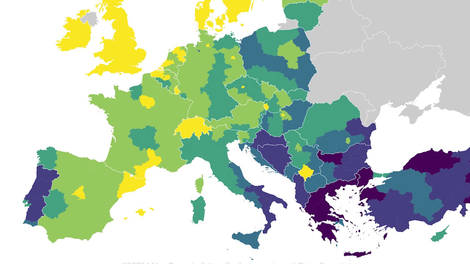
Apart from wreaking further economic havoc, the most recent phase of the global recession has also sparked some interesting maps. One particularly striking example of ‘double-dip cartography’ is this Eurozone map [3], in the anthropomorphic tradition of Fred Rose’s Serio-Comic Map of Europe (1877) [4].
Rose’s map influenced a generation of cartographers to portray the countries of Europe as a group of persons, lumbering on under the approaching shadows of the First World War. As on Rose’s map, individuals contort to resemble the shape of countries, and personate symbolically appropriate postures.
On Rose’s map, the overarching theme is impending war; on Rae’s map, it’s the euro crisis:
Greece is a bald man [5], leaking money into the Aegean Sea, his left arm and hand awkwardly extended eastward to resemble Western Thrace. By next year, [Greece’s] debt is expected to be almost twice as large as its economy, a legend explains the pecuniary penury of the Grecian gentleman. Cyprus, shown in an inset, is hand extending a wad of cash: [Cyprus’] banks have lent a ton of money to Greece.
Portugal is a crowded box (showing the hordes of locals who don’t even have a high school diploma), Spain a comfortably empty patch of beach where laid-off workers can potentially get 33 days of severance pay for every year of service.
The elbow of an elderly French monsieur grasping his aching back is the Breton peninsula. Together with an equally decrepit-looking old woman, he impersonates the fact that in France, more than 85% of older people’s incomes comes from the government. Germany is cluttered up with some of the stuff the world’s third-largest exporter produces, while Estonia with its strong electronics and communications sector is depicted as a pile of consumer electronics, since it has that rarest of eurozone economies, with a gdp that is expected to grow.

The subject of this second map, Icelandic in origin, is similar to the first one – the eurozone – but it is less descriptive, choosing to make a single, satirical point. Continental Europe resembles a boozing beggar, holding up his hat for a handout, promising: “I alvôru, ég er bara að ganga í gegnum timabil.” [6]. Greece is an empty beer can, Italy for once an arm rather than a leg (Portugal and Spain fulfil the latter role). Denmark is the snot running from Norway, Europe’s nose.
The point of the cartoon is to expose a perceived perversion in the eurozone system, not unlike the addiction of an alcoholic: the subject confuses problem and solution, thinking just a bit more poison (money or booze, respectively) will bring relief.
Formally, the cartoon is imprecise: it means to depict the eurozone, but includes many countries outside the monetary union (Norway, Sweden and the UK, to name the most blatant ones). But maybe the map, imprecise as it is, says something about Iceland’s attitudes towards Europe. An earlier Icelandic cartoon discussed on this blog [7] shows a Frankenstein Europe, a brutish automaton made up of individual member states, about to crush Iceland. Maybe seen from an isolated distance, and from a thinly populated island, Europe looks like a single entity, a nefarious bull in the Icelandic china shop.

America’s economic woes are similar to Europe’s, but at least (or at least as yet) the US does not have to contemplate the terminal divergence of its monetary union. On both sides of the Atlantic, popular protest against the financial system has spilled out into the streets and parks. This map shows the location and sizes of the main protest sites in the United States, with ‘Occupy Wall Street’, being the original location, also the most important one. The accompanying ‘league table’ lists numbers of occupiers and numbers of arrests – indicating the two main ways of seeing this movement: as a triumph of civic empowerment and direct democracy, or as a disruptive thorn in the side of the system, on which eventual recovery will be dependent. Do the red spots spreading from the coasts inland denote ‘liberated’ or ‘occupied’ territory?
Many thanks to Phillip Leeny for sending in Andrew Rae’s Eurozone map, which first appeared here in the New York Times; to Anna Th. Rognvaldsdottir and Sveinbjörn J. Tryggvason for the Icelandic map, which first appeared here in the Icelandic newspaper Fréttablaðið; and to Daniel Honan for the Occupy the United States map, which appears here.
_______
[1] Technically, a sovereign debt crisis, whereas the ‘first dip’ was a subprime mortgage crisis. The distinction is lost on most non-economists, and both are not entirely dissimilar, nor indeed unconnected.
[2] Portmanteau for [German Chancellor Angela] Merkel and [French president Nicolas] Sarkozy, the Brangelina of the current European financial crisis.
[3] Full disclosure: the map appeared on the New York Times website, which also hosts Borderlines, another blog by yours truly.
[4] See #521.
[5] The resemblance to Greece’s former prime minister George Papandreou is probably not coincidental.
[6] “Seriously, this is just a phase I’m going through.”
[7] See #416.