‘Charcoal Australia’: This viral image isn’t the full story
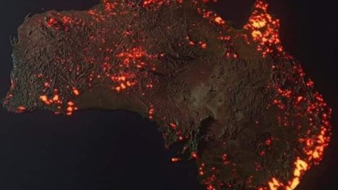
Image: anthonyhearsey.com
- A viral photo shows Australia smoldering like a piece of charcoal about to ignite.
- The composite image shows all fires over an entire month, which is not the same as all fires raging at the same time.
- That’s not to say the devastation isn’t real, and growing–as proven by another map.

Police and firefighters near the scene of a bushfire in Yanderra, New South Wales, in late December 2019.
Image: Helitak430, CC BY-SA 4.0
Bushfires from space
How bad are the fires in Australia? They’re huge, deadly and apocalyptic. But not quite this bad. This three-dimensional visualization of the bushfires Down Under is going viral, in part because it was ‘miscaptioned’ – to the horror of its creator, Anthony Hearsey.
The image purports to be a view on the country’s bushfires from space. It shows Australia lit up all over, like a smoldering piece of charcoal about to ignite entirely. As the saying goes, a picture is worth a thousand words. And nothing illustrates more eloquently the devastating emergency of Australia’s bushfires than this horrific map.

3D composite image of bushfires in Australia from 5 December 2019 to 5 January 2020.
Image: anthonyhearsey.com
Composite image
However, this is not “a photo of Australian fires taken from the Space Station’, as some would have it. The truth is a bit more nuanced.
Yes, Mr Hearsey—a photography and post-production specialist—based his map of Australia on actual images from NASA satellites. But it’s not a single image of fires raging at the same time; rather, it’s a composite image, of all fires that have raged between 5 December 2019 and 5 January 2020. “This is NOT A PHOTO,” Mr Hearsey says. “Think of it as a prettier-looking graph.”
As a ‘collection’ of all the fires that raged within the limited time frame of a single month, the image remains a shocking enough indicator of the fiery emergency that Australia is facing at the moment. All the areas lit up have been affected by bushfires over the past month—but they are not all still burning.
Fact-checking website Snopes.com referenced the image under the heading fauxtography, providing the context that is lacking in the many other places that the picture is showing up: “Composite images created from multiple data inputs are often mistaken for literal photographs.”

3 January: if the bushfires had centered on London and burned in a neat square, they would have engulfed Cambridge, Oxford and Southampton.
Image: The Guardian
The size of Denmark
Here are two other maps that help put the Australian bushfires in a proper context. They both show the combined area burned by bushfires in the Australian states of New South Wales, Queensland, South Australia, Victoria and Western Australia. Both are centered on London.
The first one dates from 3 January, at which time the affected area comprised 4.3 million hectares. That’s 43,000 km2 (16,600 sq. mi.), which corresponds to a square that includes Oxford, Cambridge and Southampton and extends to the coast of Kent. For the less London-centric, that’s an area about the size of Denmark, or slightly larger than Maryland.

6 January: The square has doubled in size, now also covering the north of France.
Image: The Guardian
8.4 million hectares
The second one dates from 6 January, when the burned lands totaled 8.4 million hectares. That corresponds to 84,000 km2 (32,400 sq. mi.). In just a few days, the area devastated by fire has virtually doubled. The square has grown significantly, now encompassing England up to the Wash and well into the Midlands and covering a much larger part of the English Channel, up to and including a strip of northern France. That corresponds to about the size of Austria, or South Carolina.
The size of the affected area is monitored by this map at The Guardian. Sadly, there seems little doubt that the square will continue to grow, covering an ever greater area of the UK and France. The map is interactive: It allows you to zoom out and recenter the square over any part of the world you may be more familiar with, to—literally—bring home the size of Australia’s trial by fire.
To donate much-needed funds to help fight the fires and support its victims, visit this list of places to donate, compiled by The New York Times.
Image of ‘charcoal’ Australia found here at anthonyhearsey.com. First, smaller ‘burnt square’ found here at the Mapporn subreddit. Second image found here at The Guardian.
Strange Maps #1005
Got a strange map? Let me know at strangemaps@gmail.com.
