Countries with more butter have happier citizens

Image: Carey Tilden/Wikimedia Commons, CC BY 2.0
- Haiti and other countries with low butter supply report low life satisfaction.
- The reverse is true for countries such as Germany, which score high in both categories.
- As the graph below shows, a curious pattern emerges across the globe. But is it causation or correlation?
“Give me a good sharp knife and a good sharp cheese, and I’m a happy man”. Perhaps not a quote you’d expect from the creative mind behind Game of Thrones, but maybe George R.R. Martin is onto something.

Image source: Our World in Data
Life’s better with butter
According to this infographic, there is a clear, statistical link between self-reported levels of life satisfaction in countries worldwide (vertical axis) and the per-capita supply of dairy products — in this case, butter (horizontal axis).
Of course, butter is not cheese: for one thing, it contains only trace elements of casein, a chemical compound associated with dairy, but much more prevalent in cheese, which causes a feeling of euphoria.
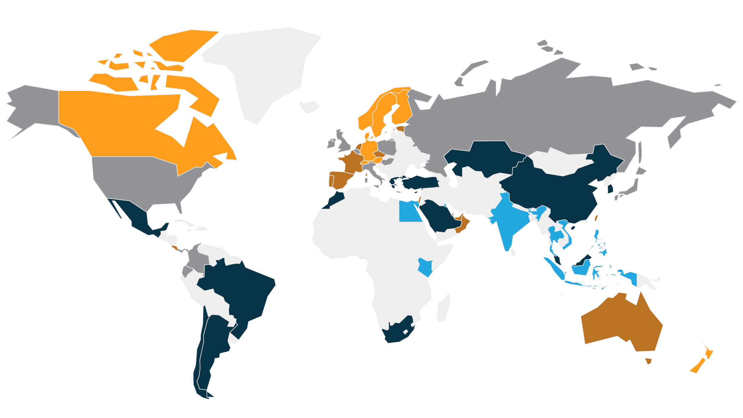
Yet as the map shows, an abundance of butter does make people happy. Or could it be a case of correlation instead of causation? In that case, something else influences both life satisfaction and the availability of butter to go up and down together. Perhaps… the associated availability of cheese?

Image source: Our World in Data
No butter, no joy
So, what does the map actually show? On the horizontal axis, the butter supply per capita:
- Extremely low (
- Middling (0.1-1 kg/year) in Nicaragua, Jordan and Romania, for example.
- Abundant (>1 kg/year) in places such as Canada, Australia and Germany.
For those countries (and those plotted near them on this graph), low, middling or abundant per-capita butter supply corresponds with low, middling and high levels of life satisfaction:
- Less than 5 out of 10 for Haiti, Cameroon and Malawi, and even less than 4 for Madagascar.
- Between 5 and 6 for Jordan, Romania, and Nicaragua.
- Between 7 and 8 for Canada and Australia, just below 7 for Germany.

Image source: Our World in Data
Middle of the road, in both categories
Of course, there are outliers: Salvadorans make do with less than 100 grams of butter per year, yet report life satisfaction between 6 and 7 out of 10. Despite getting their hands on less than 1 kg of butter per year, Mexicans score near the top of the league when it comes to happiness.
On the other hand, Egyptians get more than 1 kg of butter per year yet linger on the wrong side of 4/10 on the “Cantril Ladder,” which measures life satisfaction.

Image source: Our World in Data
Happiness is a warm knife. Through butter. Lots of butter
Nevertheless: “In my time studying global food and nutrition I’ve never seen the issue (illustrated) with such clarity,” says Hannah Ritchie, an environmental scientist and data visualization specialist at Oxford University, who published this graph on her Twitter.
Ritchie is the co-author of Our World in Data, which uses infographics to illuminate a broad range of subjects, including population, health, energy, the environment and, yes, food.
Strange Maps #962
Got a strange map? Let me know at strangemaps@gmail.com.


