In this Dutch town, the euro’s fictional bridges are now real
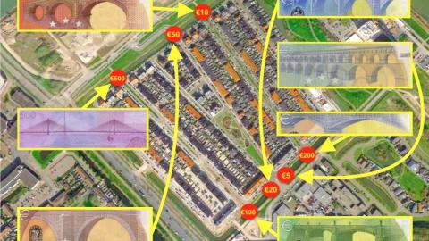
Credit: Google Maps, ECB (Graphics: Ruland Kolen)
- The euro banknotes feature seven different bridges – all of them fictional.
- They represent periods instead of places, so as not to offend anyone.
- But one Dutch town has turned monetary fiction into monumental fact.

Go to the end of this street to find Heartbreak Hotel.Credit: Google Street View
In topography, there’s a wonderful subcategory of places that existed first in the imagination before they materialized on the map. Examples range in size from the New York landmark of Agloe, a tiny map trap that accidentally became real (see #643) to the huge country of Pakistan, one man’s dream turned into a home for millions (see #647).
For an example at the intersection of lyrical and whimsical, book a stay at Heartbreak Hotel. It’s in Memphis, right across from Elvis Presley’s Graceland mansion. The King of Rock ‘n Roll had a hit with that title back in 1956. Today, as in the song, you’ll find the hotel down at the end of Lonely Street.

The euro bridges were designed to be transnational – but now they’re all Dutch.Credit: Google Maps, ECB (Graphics: Ruland Kolen)
And then there’s the otherwise unassuming Dutch town of Spijkenisse, where you can take a walk across seven brightly-colored bridges which until recently only existed on banknotes.
You might recognize those bridges. If you’ve ever handled euro notes, you’ll have seen them on the reverse of each of the seven denominations. Those bridges, however, are not real. Unlike other currencies, which often double as patriotic pamphlets and/or tourist teasers, the euro notes do not feature real-life landmarks or real-dead Europeans.
That would have involved favoring some countries and leaving out others, and in a multinational endeavor like the pan-European currency, that was a definite no-no.
So, what to do? It’s a problem that had to be solved relatively recently, as the euro is the youngest of the world’s major currencies. The look of the euro notes can be traced back to a European Council meeting in Dublin on December 13, 1996, when the European Monetary Institute (the precursor of today’s European Central Bank) announced the winner of its competition to design the euro notes.

The five-euro bridge: Classical, and dirt-grey.Credit: ScWikiSc, CC BY-SA 4.0
The prize went to Robert Kalina, a designer with the National Bank of Austria. His ‘Ages and Styles of Europe’ was chosen from among 44 contenders. Mr Kalina had some form in the matter. All Austrian banknotes from 1982 onwards were by his hand, as were notes he later designed for Bosnia-Herzegovina, Azerbaijan, and Syria.
Mr Kalina’s euro designs scrupulously avoided any allusion to particular people or places, referring merely to abstract, supra-national style periods. The obverse of each note shows a window and a doorway, symbolizing Europe’s spirit of openness. Each reverse shows a bridge, exemplifying communication and cooperation, both between the countries of Europe and between Europe and the rest of the world.
The architectural style of each note progresses chronologically as the value of the denomination increases. Most also feature a color from the rainbow spectrum.

The ten-euro bridge, Romanesque in style and red in color.Credit: ScWikiSc, CC BY-SA 4.0
- €5: Classical (as this was to be the most widely used note, grey was chosen to mask the dirt)
- €10: Romanesque (red)
- €20: Gothic (blue)
- €50: Renaissance (orange)
- €100: Baroque and Rococo (green)
- €200: 19th century Industrial (yellow)
- €500: 20th century Modern (purple)
These euro bridges would have remained fictional, were it not for Robin Stam. The Rotterdam-based artist got the idea of turning financial fiction into architectural fact in a pizza place, while fiddling with a euro note. “Suddenly it struck me how amazing it would be if these fictional bridges came to life,” he said.
Mr Stam found a willing partner for his idea in the city council of Spijkenisse, his hometown, a suburb of Rotterdam. The plan was to build seven euro bridges across a canal that almost entirely surrounds an area called De Elementen (‘The Elements’).

Gothic blue: the twenty-euro bridgeCredit: ScWikiSc, CC BY-SA 4.0
But before he got started, Mr Stam felt he needed the blessing of the European Central Bank. The euro notes scrupulously avoid favoring one member state over the other, but Mr Stam’s euro bridges would all be in one country – the Netherlands. Would the ECB mind? Mr Stam sent them a letter. But he needn’t have feared: out of Frankfurt came a kind reply with an official letter of approval. “Their main concern is counterfeiting. And you can’t pay with a bridge,” says the artist.
And so, ‘The Bridges of Europe’ got underway. Funded by the city and aided by local contractors, all seven bridges were installed between October 2011 and September 2013. They all preserve the color and shape of the ‘originals’. All were made of concrete except the two most recent styles (€200 and €500 notes), which were made out of steel. In all the project cost around €1 million to complete.

The fifty-euro bridge, in Renaissance orange.Credit: ScWikiSc, CC BY-SA 4.0
However, the euro bridges of Spijkenisse are not as monumental as their depiction on the notes suggests. In fact, they’re pedestrian in more than one sense. Mr Kalina, who first drew the fictional bridges, while amused by the project, has said he would have liked the bridges to be built in the style in which each was designed, instead of their appearance being used as a “kitschy façade.” So, it’s perhaps more appropriate to call them ‘follies’, but then many have said the same about the euro itself.
From 2013 onwards, a second series of euro notes was published. This ‘Europa’ series–named after the Greek goddess who is watermarked into the notes–is a redesign by the German banknote designer Reinhold Gerstetter, who wanted the notes to be “more colorful, so they would appear friendlier”.

If it’s Baroque/Rococo and green, it must be the one-hundred-euro bridge.Credit: ScWikiSc, CC BY-SA 4.0
The basic design of the first series, including the colors and bridges, has been maintained, with one notable exception. The Europa series no longer features a €500 note, out of concern that it appeared to be more useful to criminals than to law-abiding citizens.
The reason is its exceptionally high value. True, Switzerland has a 1,000-franc note (app. € 900, or US$ 1,075), but the euro is the only major currency to have a note this valuable. Compare the US dollar, which has the $100 bill as its highest denomination.
Because it is so valuable and was so relatively widespread, the €500 bill is ideal for transferring large amounts of money in a compact volume of notes. Turns out that quality was greatly appreciated by money launderers, drug smugglers, and tax dodgers.

Industrial and yellow – the two-hundred-euro bridgeCredit: ScWikiSc, CC BY-SA 4.0
The notes soon acquired the nickname ‘Bin Ladens’ because, despite their notoriety, they were rarely seen in public. One examination by the UK’s Serious Organised Crime Agency noted 90% of the €500 bills distributed in the U.K. were in the hands of criminal organisations, who liked the note because it made it easier to launder money (the highest British denomination is £50). For that reason, the U.K. Bureaux de Change stopped trading €500 notes in 2010.
Old €500 notes will remain legal tender forever, as will other notes from the first series; but they will gradually be taken out of circulation. Spijkenisse for its part has as yet no plans to demolish the €500 bridge.
Strange Maps #1075
Got a strange map? Let me know at strangemaps@gmail.com.
Follow Strange Maps on Twitter and on Facebook.

Purple and modern, like the ‘Bin Laden’ note beloved by criminals: the five-hundred-euro bridge.Credit: ScWikiSc, CC BY-SA 4.0
