Unmapped Pleasures: from Pulsar Signal to Post-Punk Icon

In 1979, Joy Division’s debut album added a grim new landscape to the atlas of imaginary places.
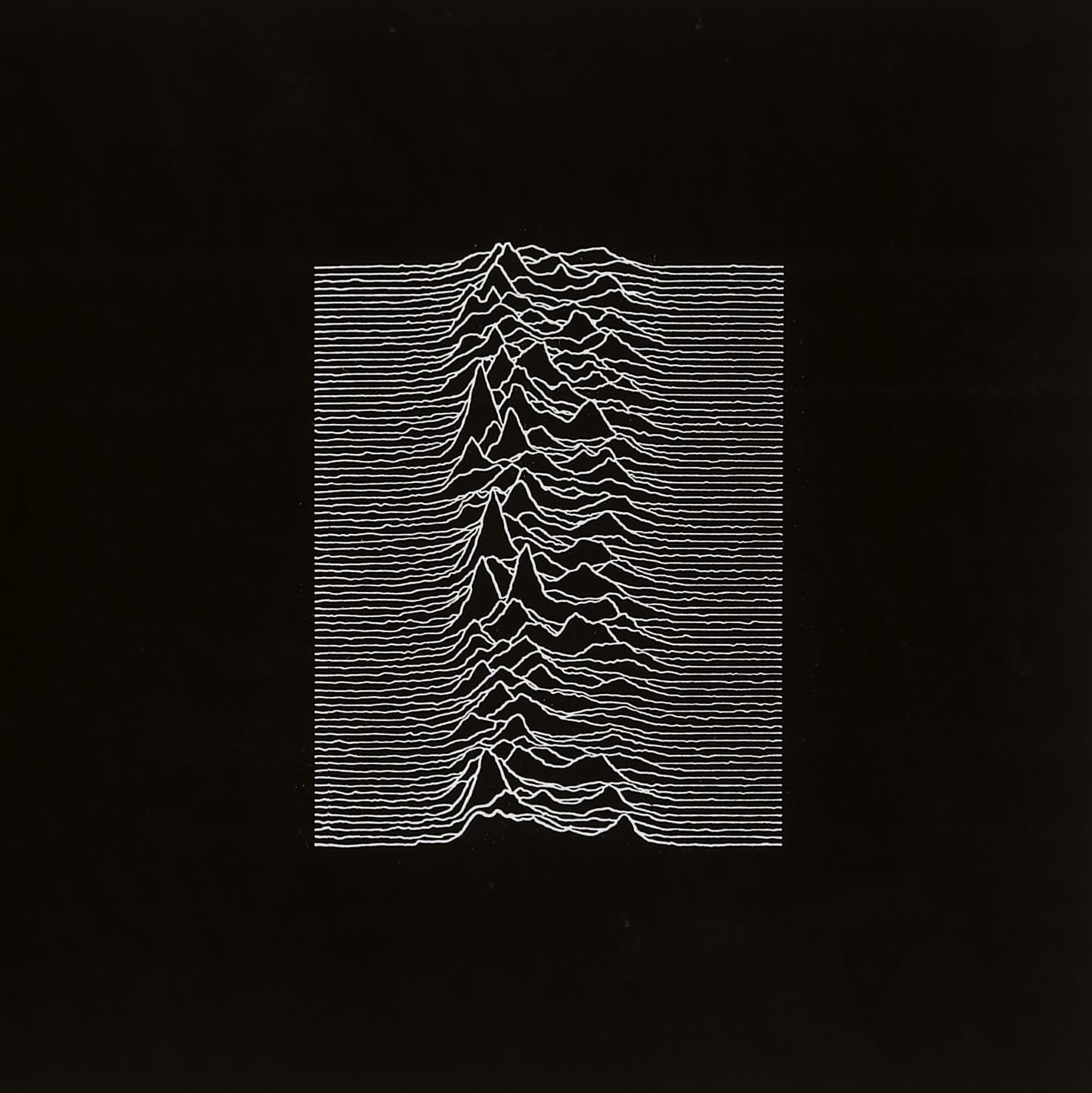
Eighty white lines traversed the pitch-black cover of Unknown Pleasures, a closed formation wrinkled up in the middle to create what looked like the cross-section of a mountain range. Those peaks and troughs were as bleak as the music onthe album, and as nameless as the delectations suggested by its title.

Doubly apt, the mysterious image was swiftly adopted as a pop-cultural icon by the post-punk generation. It was repeated on countless T-shirts, used as a template for tattoos, referenced by art and design — and even parodied by Disney. ”It’s the endless possible interpretations of this diagram that make it so powerful,” said Peter Saville, who designed the album cover (and would go on to design many more for Joy Division, New Order, and other bands).
Perhaps it’s my map obsession talking, but I beg to differ: the image’s iconic status clearly derives from its landscape-like quality.
A previous generation of teenagers swooned over Tolkien’s map of Middle-Earth, a finely detailed escapist fantasy. For young people in the early ’80s, the Unknown Pleasures cover served as the exact opposite: a negative image, literally as well as figuratively, doubling as a blind map of their disaffection. The lack of context added to its mystery, conjuring up an undiscovered country in harsh monochrome, one that this generation could truly call its own.
The album deliberately lacked any indication of the image’s context. Yet the image does have a history and a meaning, most of it well known. Fascinatingly, its earliest origins were uncovered only in early 2015, in an article in Scientific American, of all publications. The image represents a sound landscape, but not from any part of the album itself. It is the visual rendition of the radio signal emitted by CP 1919, the very first pulsar ever discovered, on 28 November 1967.

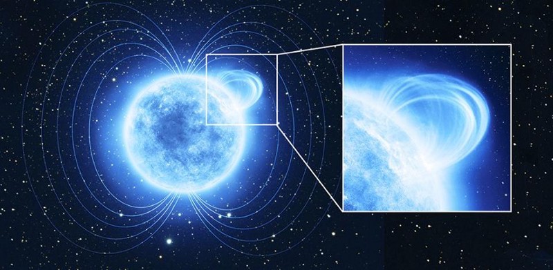
Pulsars are dense, fast-rotating neutron stars that emit a beam of electromagnetic radiation. The strength and pulse-like regularity of that signal gives them their name (in full: pulsating radio star). The existence of neutron stars had been postulated, but never observed before CP 1919. Because its signal was so regular (a period of 1.3373 seconds), it was initially called LGM-1 (for “Little Green Men”). For a while, the astronomers in Cambridge (UK), who first noticed the object in the constellation of Vulpecula (or Little Fox), theorized that it might be the beacon of an extraterrestrial civilization.
The image that eventually found its way onto the Joy Division album cover was a cut and stacked version of a continuous readout, so arranged precisely to demonstrate the regularity of the signal. But soon, the Little Green Men were discounted as a possible source; the pulsar was renamed PSR B1919+21 and the stacked image found its way into the 1977 Cambridge Encyclopedia of Astronomy, where it was noticed by the band.

”As pretty much with all groups with their first releases, they knew what they wanted on the cover […] They very astutely spotted this image as potentially a wonderfully enigmatic symbol for a record cover,” Saville relates in the documentary Data Visualization, Reinterpreted: The Story of Joy Division’s Unknown Pleasures Album. Saville inverted the black-on-white colors of the original, giving the image an ominous quality that was in tune with the bleakness of the album itself.
That’s where the image’s origin story usually ends. In a wonderful coming-together of astronomical and musical archeology, Scientific American traced the history of the image back to its earliest origin, first to an appearance in Graphis Diagrams, a 1974 hardcover edition of the influential design magazine published by Walter Herdeg in Zürich. In this publication, the image already is inverted, unlike in the Cambridge Encyclopædia, but prefiguring Saville’s negative.

The image made an even earlier appearance, this time in fetching white on cyan, in the January 1971 issue of Scientific American itself, illustrating an article on The Nature of Pulsars. The magazine credited the image to the Arecibo Radio Observatory, alas without mentioning a specific source. But Jen Christiansen, Scientific American‘s art director of information graphics, didn’t give up. And she was rewarded.

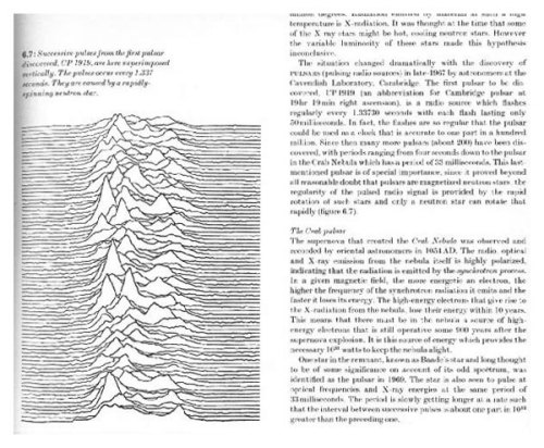
After several months, she traced the image back to Radio Observations of the Pulse Profiles and Dispersion Measures of Twelve Pulsars, the Ph.D. thesis of Harold D. Craft, Jr. Published in 1970, it reflected work done by Craft as a doctoral student at Arecibo in the late 1960s. Craft wrote the program that actually stacked the data from the pulsar in landscape format, Christiansen quotes him: “I tilted them off at a slight angle like that so that it would look like you were looking up a hillside — which was aesthetically interesting and pleasing, but on the other hand, it just confused the whole issue.”
These were the wild, early days of computerized plotting of astronomical data: “I would give [the result] to a woman draftsperson in the space sciences building at Cornell, and she would then trace this stuff with India ink, and make a much darker image of it, so that it could be printed basically.”

The comments section for Christiansen’s fantastic article (which goes into much more detail, and can be read here) brought one other publication of the “Joy Division image” to light. Its first “public” publication in fact, after Craft’s thesis, but before its appearance in the Swiss graphic design magazine.
In 1970, Craft’s India-inked image was used, this time on a bordeaux background, on the cover of Highlights of Astronomy — as presented at the XIVth General Assembly of the I.A.U. 1970. Its use on the front page of the three-yearly publication of the International Astronomical Union reflects the importance of the recent discovery of pulsars for the astronomical community.

Craft only found out about the non-scientific use of his work by Joy Division when a Cornell astronomy professor pointed it out. He promptly bought a copy of the album, and a poster too: “Just for no particular reason, except that it’s my image, and I ought to have a copy of it.”
Craft would go on to become director of the Arecibo Observatory (1973-’82) and hold several senior positions at Cornell University, of which he’s been vice president emeritus since 2011. It is unknown whether that Joy Division poster is still hanging on his wall.
Unknown Pleasures album cover found in this article on the Creative Applications Network about PulsART, an app based on the album’s artwork. The Mickey Mouse parody t-shirt is for sale here on Etsy. Page from the Cambridge Encyclopedia of Astronomy found here on Tumblr. The image from Graphis Diagrams and the one for the 1971 Scientific American article both found in a post by Adam Capriola, also on the origin of the Unknown Pleasures artwork. Three pulsar stacked graphs originally from Harold Craft’s PhD thesis, reproduced from their appearance in the article by Jen Christiansen on the Scientific Americanblogs site. The cover image of the I.A.U. publication found here at Springer.
Many thanks to Dr. Craft for the permission to republish his work.
Strange Maps #705
Got a strange map? Let me know at strangemaps@gmail.com.


