Map shows huge differences in educational attainment across U.S.

In 2000, just 26% of adult Americans aged 25 and older had a Bachelor’s degree (or higher). By 2015, the share of Americans 25 and over with a college or university degree had risen to just under a third. This year, it’s reached 34%.
Educational attainment may be rising fast in the U.S., but it’s spread unevenly. There is a slight gender imbalance: more women than men have at least a Bachelor’s degree (35% vs. 34%). And a marked racial distinction, with 55% of Asian Americans aged 25 and older having Bachelor’s degree or higher.
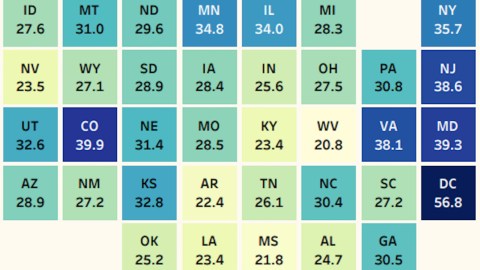
But the variation is also geographic, as this map (based on 2016 data) shows.

- The District of Columbia is the best-educated part of the country: 56.8% of its residents have at least a Bachelor’s degree.
- Second is Massachusetts, with 42.7%. While a lot of dark blue clusters on the East Coast, the third-highest score is for Colorado, way out west: 39.9%.
- Worst-scoring state is West Virginia, where just 20.8% of the residents 25 and older have at least a Bachelor’s degree. That’s just over a third of the share of Bachelor’s degree holders in DC.
- The Mountain State is marginally outperformed by Mississippi, where 21.8% have completed a college or university education.
Educational attainment is linked to income. In 2016, the average median income as divided per highest attained degree was as follows:
- $27,800 – didn’t finish high school
- $36,700 – high school or equivalent
- $67,300 – Bachelor’s degree
- $95,200 – advanced degree
Map found here at Overflow Data, via Simon Kuestenmacher. Additional information here at Marketing Charts.
Strange Maps #907
Got a strange map? Let me know at strangemaps@gmail.com.


