This Incredible Office Building Is Designed to Promote Employee Wellness

Have you ever seen a building that incorporates a product into its design? You might be familiar with the famous Randy’s Donuts facade, or have seen an ice cream shop built to resemble an ice cream cup; those are two obvious examples. But how would you incorporate into your building’s design a more abstract product like, for example, if your business sold health insurance?
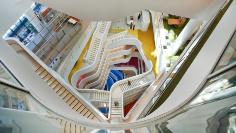
Enter: the HQ for Aussie insurance giant Medibank, designed by the noted international architecture firm Hassell.
As architect Rob Backhouse notes in the video above, the Melbourne-based Medibank wanted its office to be much more than an office. It wanted a multi-layered, integrated workplace that promotes collaboration, allows new ideas to percolate, and supports the wellness of employees. This is what Hassell came up with.
The main atrium features a rainbow spiderweb of different stairs (almost like something out of Harry Potter, though much more modern), which Backhouse explains contributes to the building’s overall theme: movement. The building’s design encourages employees to walk to their destination rather than take an elevator. Other wellness-based features include several green “retreat and rejuvenation spaces,” which employees can use to duck away from the stresses of work.
Medibank’s HQ exhibits many of the key features of ontological design, which Big Think expert Jason Silva explains is the idea that our surroundings play a major unseen role in shaping our lives:
Since the building opened in 2014, a vast majority of Medibank employees have reported improvements in productivity and morale. Both Medibank and Hassell believe the new HQ has reshaped the company’s culture — that the design has, as Silva would say, designed the company back, perhaps even in ways that may not be entirely noticeable to those on the receiving end. That’s the big idea behind ontological design: Your subconscious is a canvas and your surroundings are the painter of your being.
As far as Medibank is concerned, if its fancy new building really has painted more productive and happy employees, then the partnering with Hassell was a major experimental success.
Source (and for additional photos): Dezeen
Photo: Hassell
**
Robert Montenegro is a writer and dramaturg who regularly contributes to Big Think and Crooked Scoreboard. He lives in Washington DC and is a graduate of Loyola Marymount University in Los Angeles.
Twitter: @Monteneggroll. Website: robertmontenegro.com.


