When Restaurant Menus Employ the Power of Suggestibility

What’s the Latest?
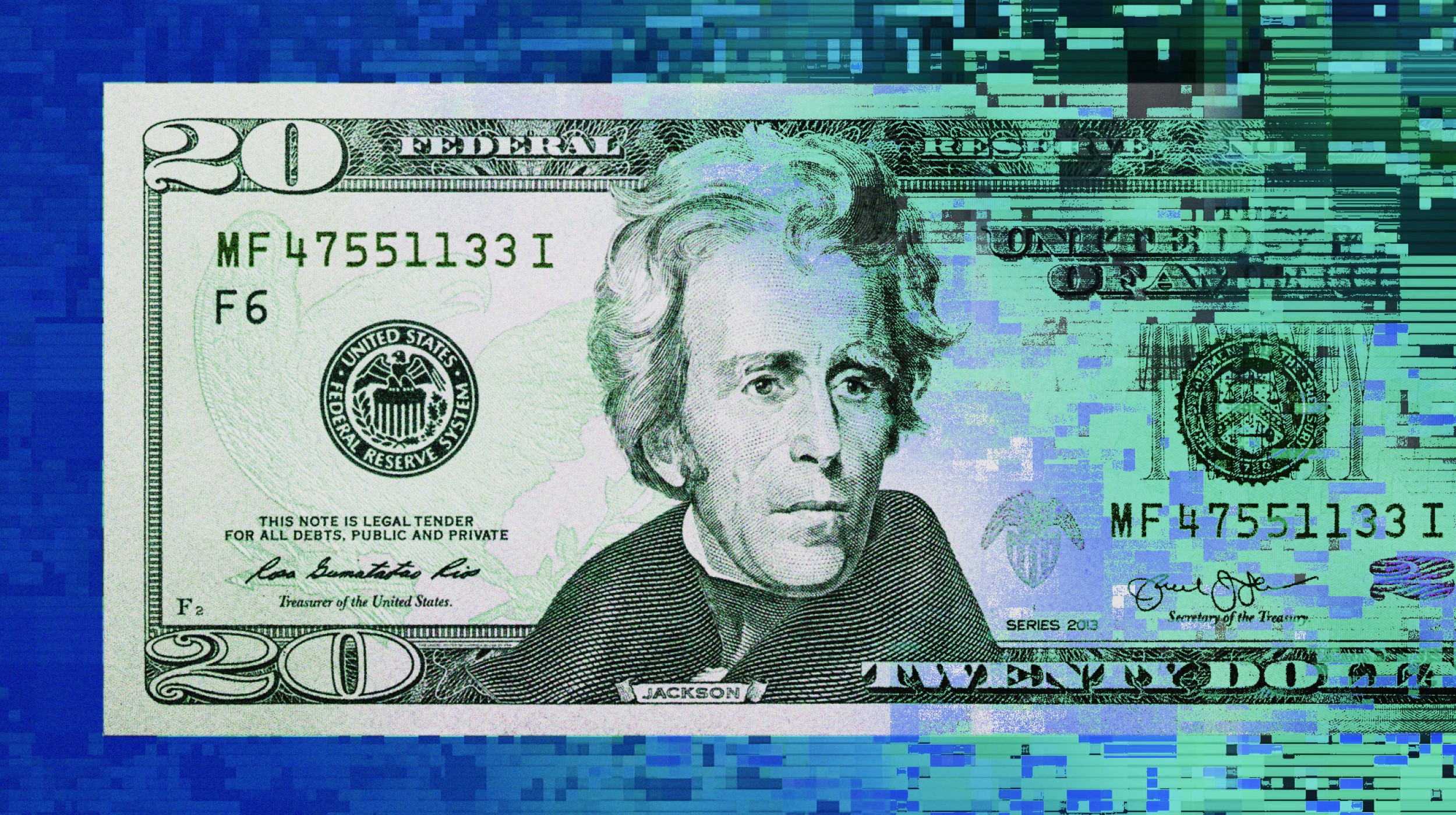
Is your brain being tricked into seeing value on a menu where there isn’t? As Bill Gephardt writes in The Utica Observer-Dispatch, there’s a psychological aim in the specifics of menu design. Gephardt points to a Cornell study that found customers spend more when the menus they order from does not feature dollar signs in the prices:
Researchers believe patrons simply link the dollar sign to the pain of paying, so they’re more likely to order cheaper options.
What’s the Big Idea?
Gephardt provides other examples of the psychology in action on well-crafted menus. For instance, a price that ends in 95 cents appeals more than one that ends in 99 cents. Even though the difference is a measly four cents, the brain reacts much more openly to the former than the latter. Long and detailed descriptions of menu items are another way restaurateurs attract eyes to more expensive dishes. Finally, Gephardt confirms what so many of us probably already believe when we see a menu item so ridiculously expensive and think “who would choose that?” The answer? No one, usually. And that’s the point:
Researchers say it’s on the menu not because the restaurant really expects to sell many of those dishes — it’s to make other items look like relative bargains.
Read more at the Utica Observer-Dispatch
Photo credit: Minerva Studio / Shutterstock


