Where Americans prefer to eat and drink coffee in each U.S. state
- Even though McDonald’s and Burger King are everywhere, America is not a food monolith.
- These maps show substantial regional variation in the locals’ choices for fast food and coffee.
- Guaranteed, these maps will depict shops and stores that you have never heard of.

When non-Americans think of American fast food, the first thing they picture are the Golden Arches of McDonald’s. That’s because McDonald’s usually is the first U.S. burger chain to open franchises in other countries. In fact, the arrival of the second one — typically, Burger King — routinely amazes some of the less sophisticated locals: America has more than one type of hamburger dispensary?
Homogenous and monotonous?
Viewed from overseas, America’s food landscape appears more homogenous and monotonous than it actually is. Up close, not only are there more brands than you can shake a stick at, there’s also an appreciable variance in regional distribution.
True enough, McD and BK are everywhere. But if you want to order your chow from In-N-Out Burger, like those deadbeat bowlers in the cult classic The Big Lebowski, your choice is limited to seven of America’s 50 states. Almost 70% of In-N-Out locations are in its home state of California. The rest are in nearby Nevada, Arizona, Utah, Colorado, Texas, and most recently Oregon.
The same goes, mutatis mutandis, for grocery stores, coffee shops, pizza places, and other retail chains (both food and non-food). Apart from a handful of nationwide brands, there is a lot of local variety. Could you blindfold a connoisseur of consumerism, drop them along a random suburban road sprawling with shops, and expect them to identify the state they are in based solely on the signs they see? Quite possibly. But only if they are familiar with the following maps, and probably a few more.
Bigger than BK and Wendy’s put together
Let’s start with those burgers. Nathan Yao, the visualisation virtuoso who runs FlowingData, serves up America’s burger landscape in 23 sizzling slices, one for each chain with at least 100 restaurants. A caveat: the maps are from 2014, so the landscape will have shifted somewhat. The picture is nevertheless revealing.

The largest chains map perfectly onto the country’s overall population density. In other words, everywhere there are people, you will find the Big Three. However, McDonald’s is more everywhere than anyone else: The burger giant has more locations than Burger King and Wendy’s, numbers two and three, respectively, put together.
Further down the list, interesting regional patterns start to emerge. Dairy Queen locations are noticeably thin on the ground in Oklahoma, Arkansas, Louisiana, and Mississippi. Sonic seems much better established in those states, but in turn is largely absent from the West and northern Midwest. Jack in the Box is heavily present on the West Coast and in Texas, but totally absent from the East Coast. Hardee’s/Carl’s Jr. is big in California and the South. Five Guys thrives in the Boston-Washington corridor, while Whataburger clearly is a Texas thing. And so on.
A smudgefest of various preferences
Another way to look at America’s burger landscape is to see which of the chains dominate where (based on Foursquare check-ins). This composite map shows that a few states are beholden to a single chain. Nevada is In-N-Out territory; Carl’s Jr is king of Alaska.
In some other states, one brand predominates but has to tolerate the presence of others: Whataburger in Texas, Dairy Queen in Maine, Culver’s in Wisconsin. Mostly, though, each state is a smudgefest of various preferences. Just trying to figure out how many regional favorites there are in, say, Arkansas or Ohio requires pretty good eyesight.

But wait a minute: The two biggest chains barely register on this map. Can it be that either McDonald’s or Burger King are number one only in mid-Nebraska, parts of New England and New York state, and a few other scattered places? I smell a rat. A deep-fried one.
As mentioned above, this map was compiled some years ago by Thrillist based on 20,000 Foursquare check-ins. Perhaps this method somehow disfavors the King and Clown. (For instance, maybe people don’t want to admit they’re chomping on a Whopper.) Or is it that, as big as they are nationally, they are generally outperformed by local heroes across most of the country?
The Starbucks-Dunkin’ divide
When it comes to coffee, the coasts clearly have different ideas about where to get their favorite cup of joe. This map by Maptitude shows the largest coffee chain per county, and darkens their respective colors based on density. The West Coast (and the West in general) is clearly Starbucks country, with the counties in and around Seattle, the chain’s hometown, going darkest green.
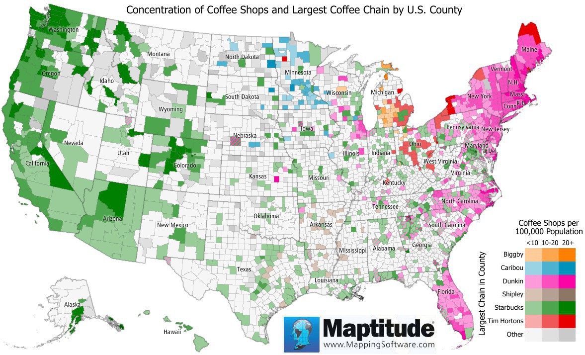
However, the Starbucks empire extends way further east, with clumps of green counties sprinkled across most of the country. There’s a huge cluster around Washington DC, and in one or two places, the realm of the two-tailed mermaid reaches all the way to the Atlantic. The rest of the East Coast is solid pink, however, indicating that these denizens would rather get their coffee at Dunkin Donuts, thank you very much.
Dunkin’ doesn’t travel as far west as Starbucks does east. The furthest outpost of undisputed DD territory is a county in eastern Kansas, colored deep pink, indicating more than 20 Dunkin’ Donuts franchises per 100,000 inhabitants. That would be Chase County, which has a population of about 2,500. Statistically, half a Dunkin’ Donuts shop would have been enough to give the county its dark hue. We suspect they have a single, complete one. It’s weird though that DD didn’t think of putting that franchise just two jurisdictions to the east, in Coffey County.
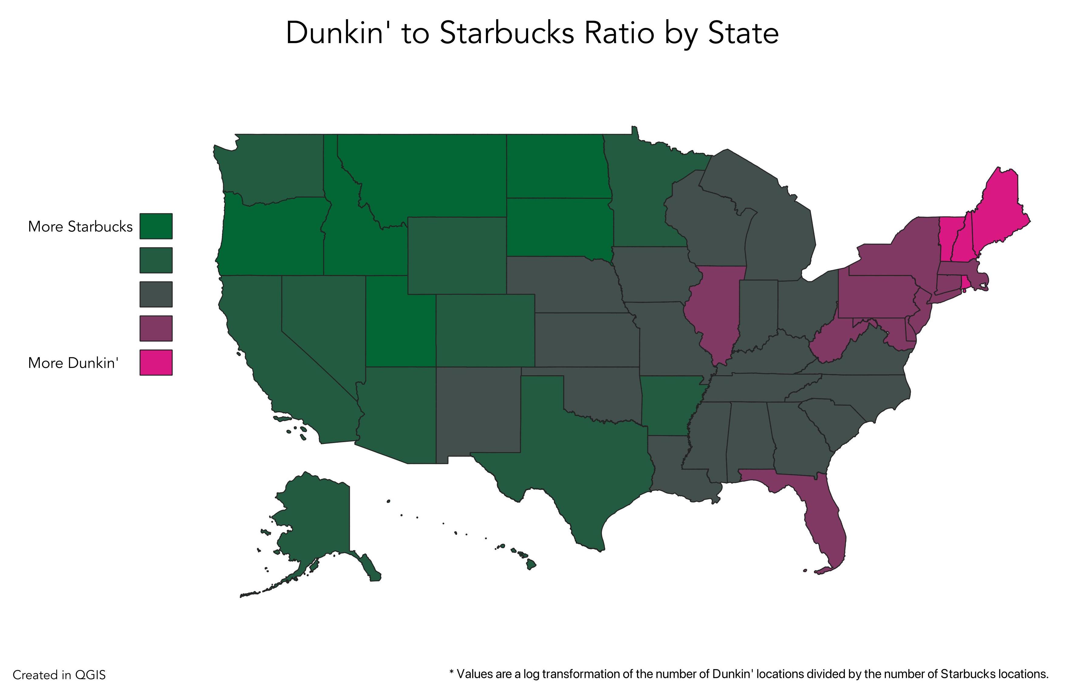
Another way to consider the Starbucks-Dunkin’ debate: This map divides the country into five distinct zones based on the Dunkin’ to Starbucks ratio. It’s clear who the winner is.

Illinois, Florida, and a handful of northeastern states are the only ones where DD out-locates Starbucks. But only four states — Vermont, New Hampshire, Maine and Rhode Island — stand out as places where Dunkin’ clearly dominates. It’s like that map at the beginning of Asterix comics, showing how Rome has conquered all of Gaul, except our hero’s little village.
Strange Maps #1215
Got a strange map? Let me know at strangemaps@gmail.com.
Follow Strange Maps on Twitter and Facebook.
