Two-thirds of U.S. students attend diverse schools

Image courtesy of Cédric Scherer
- In 2020, there will be more children of color than white children in the U.S.
- These maps indicate how racial diversity is changing the demographics of America’s schools
- Diversity has massively increased, but more so in the south and on the coasts than elsewhere

This hex map (3) shows the degree of change in diversity in America’s schools from 1994/95 to 2016/17. A higher value (and darker color) means more change, and vice versa. The biggest change in diversity by far was noted in DC, the least in New Mexico, Louisiana and Mississippi.
Image courtesy of Cédric Scherer
Demographic change is here
The U.S. is undergoing profound demographic change: by the early 2040s, it will be a ‘majority minority’ country – whites will make up less than half of the total population.
That change won’t just suddenly arrive two decades from now. In the younger demographic cohorts, it’s already here. In 2020, there will be more children of color than white children, the U.S. Census Bureau projects.

The second hex map shows the degree of diversity itself, in 2016/17. The index tends to be higher in coastal and southern states, lower in central and northern ones. Delaware appears to have the most diverse schools, West Virginia the least.
Image courtesy of Cédric Scherer
Different degrees of diversity
Comparing nationwide data 22 years apart (1994/95 and 2016/17), the Washington Post recently examined whether the racial diversity of America’s young was matched by racial integration in its public schools. And indeed: more school districts are diverse than ever before, and more students now attend schools with children of different races than ever before.
- In 1995, 45% of students went to school in diverse districts (1), most of which tended to be in large metropolitan areas and in the South. Nearly a third of students went to school in ‘extremely undiverse’ districts: in mainly rural, mostly white areas of the country.
- Between 1995 and 2017, more than 2,400 districts switched from ‘undiverse’ to ‘diverse’, mainly in smaller cities and suburbs that had previously been almost uniformly white. In 2017, 66% of students attended school in diverse districts; the number of students in ‘extremely undiverse’ districts declined accordingly.

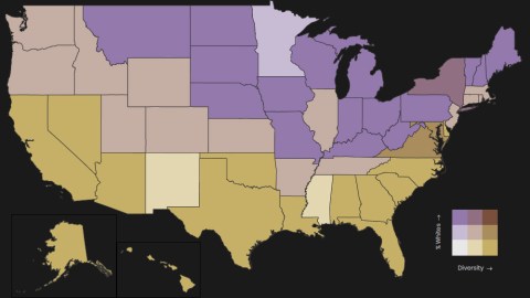
This bivariate (4) map shows both where the ‘whiter’ school districts are: in the purple states; and where the more diverse states are: in the yellow states. “Obviously, the data is partly correlated: a high proportion of whites always leads to low diversity; but still I found the pattern quite interesting,” says Mr Scherer. Low diversity also occurs in places with few white students, e.g. New Mexico and Mississippi; and New York manages to be both quite white and fairly diverse.
Image courtesy of Cédric Scherer
White or diverse? Both or neither?
- As a result, in 2017 early 11 million students went to school in ‘highly integrated’ school districts: more than ever, and nearly double the 5.8 million children in ‘non-integrated’ districts. The remainder, 10.3 million students, attended school in ‘somewhat integrated’ school districts.
These maps are based on the same data (2) used by the Washington Post, but take a slightly different tack. “I calculated the Simpsons diversity index, a quantitative measure used in ecology to estimate the species diversity in a community. High values (max 1) indicate high diversity and low values (min 1) low diversity,” says Cédric Scherer, a Berlin-based computational ecologist and data visualization designer.
Maps reproduced with kind permission from Cédric Scherer. For more work by him, check out his web and Twitter pages.
Strange Maps #998
Got a strange map? Let me know at strangemaps@gmail.com.
(1) A school district counts as ‘diverse’ when less than 75% of the student body belongs to a single race; ‘undiverse’ when between 75% and 90% belong to a single race; and ‘extremely undiverse’ when more than 90% of the students belong to a single race.
(2) The Common Core of Data from the National Center for Education Statistics (NCES). Public school data only; no private, charter or virtual schools.
(3) Maps subdivided into hexagonal tiles.
(4) Bivariate data shows the relation between two variables, in this case ‘whiteness’ and ‘diversity’.


