You can now drag and drop whole countries to compare their size
- Our world maps lie to us: North America and Europe aren’t really that big and Africa really is much bigger.
- It’s all the fault of Mercator: even if the man himself wasn’t necessarily Eurocentric, his projection is.
- This interactive map tool reveals countries’ true sizes without having to resort to the Peters projection.
Is Texas really bigger than Poland? Does Russia stretch further east to west than Africa does north to south? And how big a chunk of Europe would the U.S. cover? If you’re losing sleep over questions like these, you’ll find relief at TheTrueSize.com, a web tool designed to provide answers about the relative sizes of countries (and U.S. states).
Created by James Talmage and Damon Maneice, the application was inspired by an episode of The West Wing, in which a delegation of the (fictional) Organisation of Cartographers for Social Equality (OCSE) asks the White House to get public schools to use world maps that use the Peters projection rather than the traditional Mercator projection.
Cartographers for Social Equality – The West Wingwww.youtube.comWhy? On a Mercator map, countries in further north (and south) are shown larger than they are relative to countries closer to the equator. In so doing, one of the OCSE scientists explains, “the Mercator projection has fostered European imperialist attitudes for centuries and created an ethnic bias against the Third World,” says one OCSE scientist.
However, her colleagues point out that this was not Mercator’s original intent: “(He) designed (the Mercator projection) as a navigational tool for European sailors (…) The map enlarges areas at the poles to create straight lines of constant bearing or geographic direction.”
While those straight lines make it easy for sailors to follow directions across oceans, world maps in the Mercator projection distort the relative size of the world’s land masses — and increasingly so closer to the poles.
- The classic example, also used in The West Wing scene, is Greenland: on a Mercator world map, it appears roughly the same size as Africa. In fact, the continent is 14 times larger than the island.
- Other examples: on a Mercator map, Europe seems larger than South America; in fact, South America is almost double the size of Europe.
- And, Alaska appears three times as large as Mexico, but Mexico is slightly larger than America’s northernmost state.
However, the Peters projection deviates substantially from what many people have come to expect a world map should look like. Or, as one of the presidential aides in The West Wing said, when presented with an example, “What the hell is that?”
This app allows size comparison while avoiding the cartographic Fremdkörper that the Peters projection still is. “We hope teachers will use it to show their students just how big the world actually is,” say Talmage and Macniece.
TheTrueSize.com is great fun: move equatorial countries north and see how getting closer to the pole distorts them, as if in a house of mirrors at the carnival. Plonk countries from different latitudes next to each other and see how they’re a lot more different in size than you thought. Or a lot less. See countries shrink as you drag them from their positions high up north (or deep down south) closer to the equator.

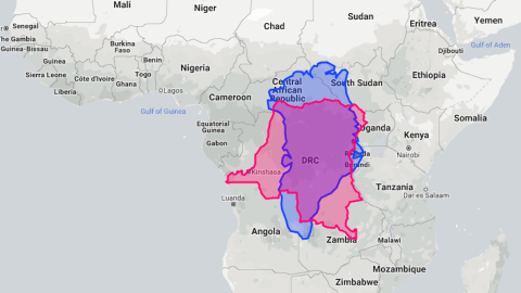
Yes, Greenland is huge. But not this huge. Because it’s so close to the North Pole, the Mercator projection stretches the Danish-controlled island out beyond all proportion. That’s why it looks as big as Africa and a lot bigger than the Democratic Republic of the Congo.
Image: thetruesize.com
Greenland and Africa, Mercator style

Drag the icy island away from its Arctic abode toward the deepest jungles of Africa, and its form shifts and its area shrinks. Greenland has an area of 836,000 square miles (2.16 million km2), which makes it a bit smaller than the DR Congo, at 857,000 sq. mi (2.22 million km2).
Image: thetruesize.com
Congo is bigger than Greenland

The symbolism of space and the prejudice of history puts the United Kingdom on top, and its former colony Tanzania way down at the bottom of this map. There doesn’t seem to be that much of a size difference between both countries.
Image: thetruesize.com
UK trumps Tanzania

Look at that: the entire U.K. fits easily into Tanzania, with a lot of room to spare. The Shetland Islands, Scotland’s northernmost archipelago, is at a safe distance from the Rwandan border, and Dover is still a day’s drive away from Dar es Salaam, on the coast.
Image: thetruesize.com
Tanzania swallows the UK

At 6.6 million sq. mi (17 million km2), Russia is the world’s largest country. But Mercator makes it look larger than it is. Drag and drop it near the equator, and you see how truly huge Africa is: at 11.73 million sq. mi (30.37 million km2), it is almost twice the size of Russia.
Image: boredpanda.com
Russia on top

British imperialist Cecil Rhodes dreamed of a string of colonies (and a railway line) stretching “from Cape to Cairo.” He could have just gone to TheTrueSize, turned Russia on its head and dragged it over Africa: Cape Town is somewhere in the Russian Caucasus, while the easternmost point of Siberia plunges into the Mediterranean, well, north of Cairo.
Image: thetruesize.com
Russia on its head

Texas is bigger than Poland. You could drop it over the map of Eastern Europe and have it cover the entirety of Poland, and there’d be plenty of Texas left to surround it.
Image: thetruesize.com
Poland, TX

Talking about huge: stick the Lower 48 onto Europe, and you immediately see how both compare for size. If Seattle would be in the west of Ireland, Istanbul would still be in the same country — in southern Texas. Los Angeles would be on the Franco-Spanish border and Chicago just north of Moscow. New York? Deepest Siberia. Admittedly, it sometimes does feel like that.
Image: thetruesize.com
Trying Europe on for size

The U.S. has a very recognisable cartographic persona, but here’s what that funhouse mirror does to it when you move it north. It inflates to a grotesque parody of its former shape (but it does rival Canada for size). Not so much deviation towards the equator, except that it shrinks. And we can’t have that!
Image: boredpanda.com
Inflated and deflated states of America

Here are the world’s ten largest countries, all dragged to neutral territory – on the equator – for better size comparison. Suddenly, those size differences don’t seem so great any more.
Image: boredpanda.com
Ten largest countries

Here’s what would happen if you placed Germany in the Midwest: Milwaukee would double as Flensburg, Nashville could be a Midwestern Munich, St. Louis would be Cologne and Fort Wayne could pretend it was Berlin. Together, Illinois, Indiana and Kentucky cover 135,000 sq. mi, almost exactly as much as Germany, at just under 138,000 sq. mi.
Image: thetruesize.com
Germany in the Midwest
Images taken from The True Sizeand here from Bored Panda.
Strange Maps #953
Got a strange map? Let me know at strangemaps@gmail.com.
