The Gross Failures of Gross Domestic Product

“The economy stupid”. These words skyrocketed James Carville to political fame and helped to elect Bill Clinton in the 1990s. The state of the economy is one of the most important questions there is economically, politically, and socially, and how well the economy is doing is often listed as the most pressing issue for the public in opinion polls.
But, how do we measure the overall state of the economy?
The most common method of measuring an economy as a whole is by means of GDP, or Gross Domestic Product. GDPis simply the total value of all goods and services produced in a country in a given period of time, most often a year. Brought to the forefront of global economics in 1944 by the Bretton Woods Conference, it continues to be the primary means of measuring a country’s economic health.
It is a very general measure, often difficult to make, that can be interpreted in many ways. It is extremely useful when you are trying to grasp a lot of information in a single figure, like how exports and imports affect an economy, how two countries compare in overall wealth, and so on.
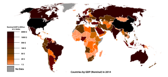
Here is a map of the world colored by GDP. You can see China and the United States are far richer than most other countries, that nations in the south are often poorer than those in the north, and smaller nations generally have less money than their larger neighbors as well.
Is this everything there is to see?
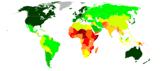
Well, no, and there lies the problem. Here is a map of GDP per person in any given country.
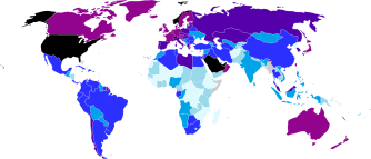
In this image, the darker the color, the higher the GDP per person, black being highest. Light blue is the lowest end of the scale. Notice the changes in apparent wealth in Asia.
As you can see, the values change a lot. China, the second richest nation in the world, becomes a middle-tier country on this map, while little Luxembourg in Europe, which has less money than Warren Buffet, has a remarkably high GDP per capita, showing that its population is better off, on average, than most other countries in the world.
Neither of these maps, however, show us the actual distribution of wealth. It is possible in both maps for one person in each country to have all of the money to themselves. This is another failure of GDP: it tells us only the general facts about how much money there is, and little more.
Are there any alternative measures to use, ones that might give us a better picture?
There are a slew of alternative measures for a nation’s welfare and economic health that give more detail than GDP or GDP per capita does. One of the more interesting is the Capability Approach pioneered by Indian economist and philosopher Amartya Sen.
This method is focused on the “capability” of individuals to “to achieve outcomes that they value and have reason to value”, including “the ability to live to old age, engage in economic transactions, or participate in political activities”.
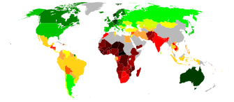
This method is put to use in the Human Development Index, based on data compiled by the United Nations, which measures a cross section of societal details such as education opportunities, healthcare access, and expected wealth, to give us an idea of the welfare of the individuals in a given nation. Here is the world map for HDI.
The darker the green, the better the HDI, and the higher the welfare for a typical citizen. Red and yellow, not so much. Credit to wikicommons.
Again, this index can suffer from generalization. There does exist, however, a corrective version of this for inequality, termed IHDI (Inequality-adjusted Human Development Index). By the UN’s definition, “the difference between the IHDI and HDI is the human development cost of inequality, also termed – the loss to human development due to inequality.” Shown here:
The darker the green, the better the IHDI. Red and yellow, not so much. Credit to wikicommons. As you can see, the benefits of development are not evenly shared across the world.
This measure attempts to make up for the failures that GDP can have in measuring how strong an economy is, by trying to tell us how well off the people in a country actually are. There is a great deal left out if one focuses only on how much wealth a nation produces. Perhaps Robert F. Kennedysaid it best about the predecessor to GDP, when he described the shortcomings of GNP.
“Gross national product counts air pollution and cigarette advertising, and ambulances to clear our highways of carnage. It counts special locks for our doors and the jails for the people who break them. It counts the destruction of the redwood and the loss of our natural wonder in chaotic sprawl. It counts napalm and counts nuclear warheads and armored cars for the police to fight the riots in our cities. It counts Whitman’s rifle and Speck’s knife, and the television programs which glorify violence in order to sell toys to our children. Yet the gross national product does not allow for the health of our children, the quality of their education or the joy of their play. It does not include the beauty of our poetry or the strength of our marriages, the intelligence of our public debate or the integrity of our public officials… it measures everything in short, except that which makes life worthwhile.”
The key problem of our key economic indicator is that it can only measure money. This is a useful tool, but not the only one. Is it time to switch the world’s major countries over to a system that relies on HDI or IHDI? Is there a better option than that? Or is our current tendency to report GDP as the most important statistic fine as it is?